import matplotlib.pyplot as plt
import pandas as pd
import geopandas as gpd
import numpy as np
from pysal.viz import mapclassify
import seaborn as snsLab in Python
Choropleths
In this session, we will build on all we have learnt so far about loading and manipulating (spatial) data and apply it to one of the most commonly used forms of spatial analysis: choropleths. Remember these are maps that display the spatial distribution of a variable encoded in a color scheme, also called palette. Although there are many ways in which you can convert the values of a variable into a specific color, we will focus in this context only on a handful of them, in particular:
Unique values
Equal interval
Quantiles
Fisher-Jenks
Importing packages
Before all this mapping fun, let us get the importing of libraries and data loading out of the way:
Data
We will be using data from the Imago Data Service for this section — specifically the Sun Probability Framework (SPF), a UK-wide dataset of annual cloud probability estimates for every small area in the country. Higher values mean cloudier conditions (a lower probability of direct sunlight); lower values mean clearer conditions. We’ll be using the 2025 release.
NoteDownload the data
Download the SPF 2025 GeoPackage from the Imago Data Service:
https://data.imago.ac.uk/datasets/cloud-probability-statistics-per-small-area-in-2025-version-2-0
Place it inside a data/ directory. Unlike the polygon/table pairs you’ve joined before, this file already contains both the small-area geometries and the SPF value in one GeoPackage — no separate join needed to get started.
# A GeoPackage can bundle multiple layers/tables -- check what's actually
# in the file before reading, since gpd.read_file() silently picks the
# first layer if you don't specify one, which may not be the spatial layer
import fiona
fiona.listlayers("data/Imago_spf/Cloud probability statistics per small area in 2025 (GeoPackage).gpkg")['SPF_LSOA_level']# Load the GeoPackage into a GeoDataFrame
spf_25 = gpd.read_file(
"data/Imago_spf/Cloud probability statistics per small area in 2025 (GeoPackage).gpkg",
layer="SPF_LSOA_level", # replace with the actual layer name from listlayers() above
)
# Plot the geometry to make sure it looks correct
spf_25.plot()
plt.show()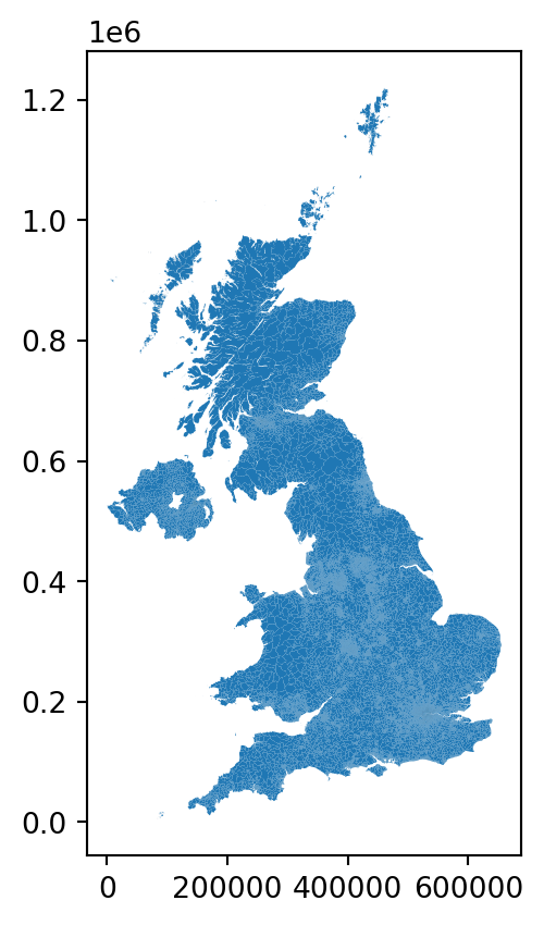
Don’t forget that before you go further, you want to check the CRS of the GeoDataFrame and take a look at its first few rows.
TipAnswer
# Check the CRS of the GeoDataFrame
print(spf_25.crs)

# Display the first few rows of the GeoDataFrame
print(spf_25.head())
EPSG:27700
data_zone_code cloud_probability \
0 E01000001 65.8183
1 E01000002 65.0145
2 E01000003 67.9649
3 E01000005 64.9263
4 E01000006 65.9036
geometry
0 MULTIPOLYGON (((532105.312 182010.574, 532162....
1 MULTIPOLYGON (((532634.497 181926.016, 532619....
2 MULTIPOLYGON (((532135.138 182198.131, 532158....
3 MULTIPOLYGON (((533808.018 180767.774, 533649....
4 MULTIPOLYGON (((545122.049 184314.931, 545271.... The principal variables we’ll use throughout are:
data_zone_code: a unique small-area identifier, harmonised across England, Wales, Scotland and Northern Ireland — the first letter tells you which nation an area belongs to (E= England,W= Wales,S= Scotland,N= Northern Ireland)cloud_probability: the annual average SPF valuegeometry: the small-area boundary
Since our “Unique values” example needs a genuinely categorical variable, and SPF itself is continuous, we’ll derive one from the data_zone_code prefix — which UK nation each small area belongs to:
def get_nation(code):
    if code.startswith("E"):
        return "England"
    elif code.startswith("W"):
        return "Wales"
    elif code.startswith("S"):
        return "Scotland"
    elif code.startswith("N"):
        return "Northern Ireland"
    return "Unknown"

spf_25["nation"] = spf_25["data_zone_code"].apply(get_nation)
Now we are fully ready to map!
Unique values
A choropleth for categorical variables simply assigns a different color to every potential value in the series. Variables could be both nominal or ordinal.
Nominal: Nominal variables represent categories or labels without any inherent order or ranking. The categories are distinct and do not have a natural progression or hierarchy, such as “apple,” “banana,” and “orange” for fruit types.
Ordinal : Ordinal variables represent categories or labels with a meaningful order or ranking. The relative order or hierarchy among the categories is significant, indicating a clear progression from lower to higher values, such as “low,” “medium,” and “high” for satisfaction levels.
In Python, creating categorical choropleths is possible with one line of code. nation is nominal — there’s no inherent ranking between England, Scotland, Wales and Northern Ireland.
spf_25.plot(
    column="nation",  # Specifies the column "nation" to color the plot based on categories
    categorical=True,       # Indicates that the "nation" column is categorical (not continuous)
    legend=True             # Adds a legend to the plot, showing the different categories of "nation"
)
# Show the plot
plt.show()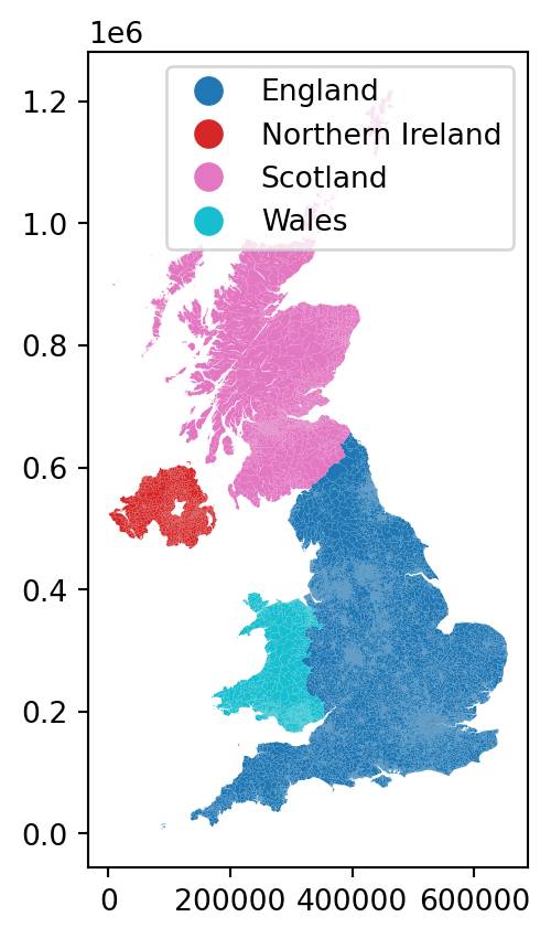
Important
These maps are all a bit rough a need quite a bit more work. They are just a starting point.
Equal Interval
If, instead of categorical variables, we want to display the geographical distribution of a continuous phenomenon, we need to select a way to encode each value into a color. One potential solution is applying what is usually called “equal intervals”. The intuition of this method is to split the range of the distribution, the difference between the minimum and maximum value, into equally large segments and to assign a different color to each of them according to a palette that reflects the fact that values are ordered.
Creating the choropleth is relatively straightforward in Python. For example, to create an equal interval map of cloud_probability.
First we need to prepare the data, going back to our data wrangling.
# Step 1: Remove rows where 'cloud_probability' is missing (i.e., remove NA values)
spf_filtered = spf_25.dropna(subset=["cloud_probability"])

# Step 2: Round to whole numbers for a cleaner legend
spf_filtered["cloud_probability"] = spf_filtered["cloud_probability"].round().astype(int)
An equal interval classification scheme produces a map of 5 classes where each class size is equal, so that each class has an equal range in between the low and high possible value. This allows for the legend to be easily understood by the viewer, since the legend entries are all the same size. However, this scheme does not show data which are skewed towards one side all that well.
fig, ax = plt.subplots(figsize=(9, 11))  # Increase the map size

# Plotting the GeoDataFrame `spf_filtered` on the `ax` axes
spf_filtered.plot(
    column="cloud_probability",  # Specify the column to be visualized
    legend=True,  # Add a legend to the map
    scheme="equal_interval",  # Use equal interval classification for the color scheme
    k=7,  # Divide the data into 7 intervals
    cmap="Blues",  # Use the Blues colormap for coloring the map -- matches spf_1.qmd's convention
    legend_kwds={
        'loc': 'center left',  # Position the legend in the center left of the map
        'bbox_to_anchor': (1.00, 0.2),  # Anchor the legend at this position (right of the plot)
        'fontsize': 10  # Set the font size of the legend text
    },
    edgecolor='grey',  # Add grey contours around each geographical feature
    linewidth=0.1,  # Adjust the thickness of the contours (optional)
    ax=ax  # Specify the axes object to plot on
)
ax.set_axis_off()
ax.set_title("SPF 2025: Equal Interval Classification", fontweight="bold")

# Adjust the subplot parameters to give more space for the legend
plt.subplots_adjust(right=0.70)  # Increase right space to accommodate a larger map

# Show the plot
plt.show()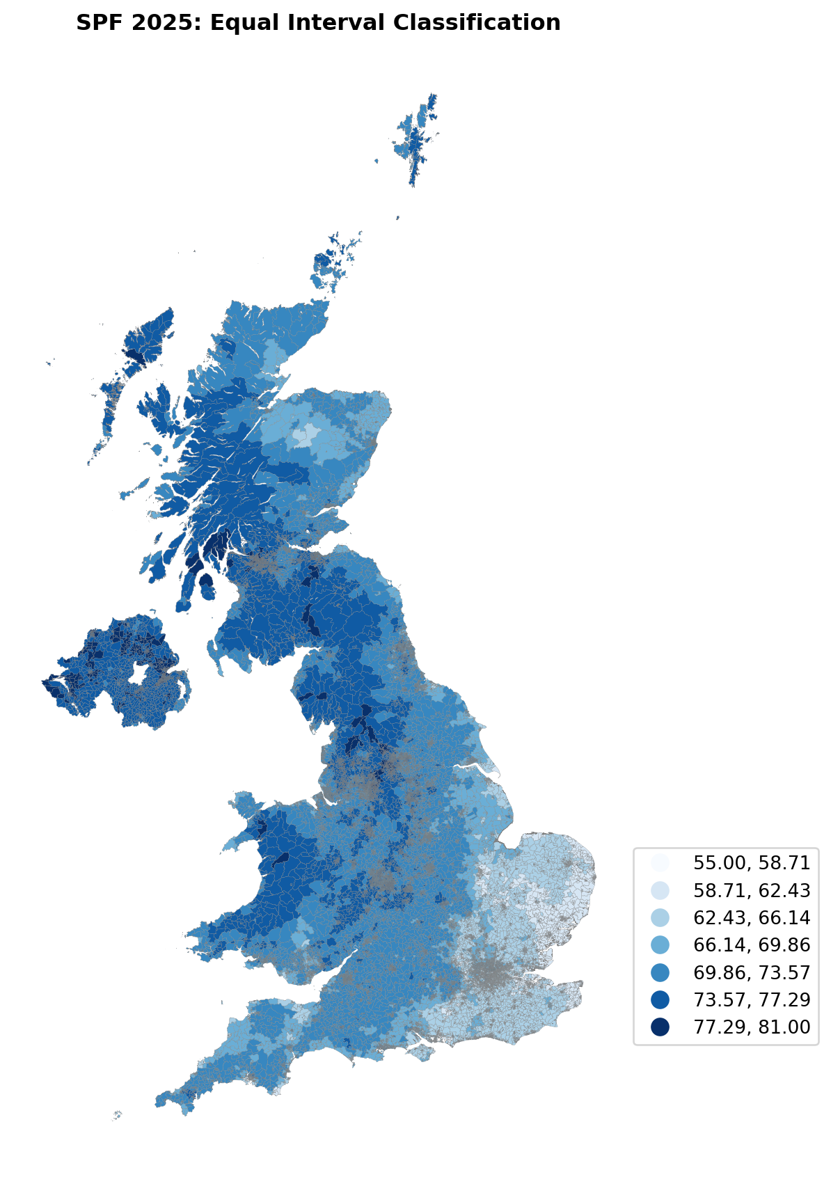
Pay attention to the key differences:
Instead of specifyig
categoricalasTrue, we replace it by the argument scheme, which we will use for all choropleths that require a continuous classification scheme. In this case, we set it toequal_interval.As above, we set the number of colors to 7. Note that we need not pass the bins we calculated above, the plotting method does it itself under the hood for us.
As optional arguments, we can change the colourmap to a blue gradient, which reflects the “cloudier = darker” intuition of the SPF variable.
TipMapclassify
The way colour maps are scaled can also be manipulated with the scheme option (if you have mapclassify installed).
The scheme option can be set to any scheme provided by mapclassify (e.g. ‘box_plot’, ‘equal_interval’, ‘fisher_jenks’, ‘fisher_jenks_sampled’, ‘headtail_breaks’, ‘jenks_caspall’, ‘jenks_caspall_forced’, ‘jenks_caspall_sampled’, ‘max_p_classifier’, ‘maximum_breaks’, ‘natural_breaks’, ‘quantiles’, ‘percentiles’, ‘std_mean’ or ‘user_defined’).
Arguments can be passed in classification_kwds dict.
See the mapclassify documentation for further details about these map classification schemes.
It is important to understand that equal intervals can first and foremost be visualised on the data distribution.
classi = mapclassify.EqualInterval(spf_filtered["cloud_probability"], k=7)
classi
EqualInterval
Interval Count
----------------------
[55.00, 58.71] | 65
(58.71, 62.43] | 1815
(62.43, 66.14] | 7837
(66.14, 69.86] | 6399
(69.86, 73.57] | 15978
(73.57, 77.29] | 12583
(77.29, 81.00] | 2167Once we have classified the variable, we can check the actual break points where values stop being in one class and become part of the next one:
classi.binsarray([58.71428571, 62.42857143, 66.14285714, 69.85714286, 73.57142857,
77.28571429, 81. ])# Set up the figure
f, ax = plt.subplots(1)
# Plot the kernel density estimation (KDE)
sns.kdeplot(spf_filtered["cloud_probability"], fill=True)
# Add a blue tick for every value at the bottom of the plot (rugs)
sns.rugplot(spf_filtered["cloud_probability"], alpha=0.5)
# Loop over each break point and plot a vertical red line
for cut in classi.bins:
plt.axvline(cut, color='darkorange', linewidth=1.25)
ax.set_xlabel("SPF (cloud probability)")
# Display image
plt.show()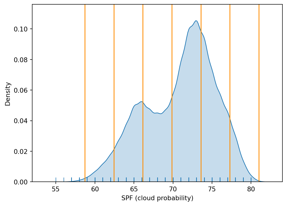
Technically speaking, the figure is created by overlaying a KDE plot with vertical bars for each of the break points. This makes much more explicit the issue highlighted by which the middle bins contain a large amount of observations while the ones at either extreme only encompass a handful of them.
Quantiles
One solution to obtain a more balanced classification scheme is using quantiles. This, by definition, assigns the same amount of values to each bin: the entire series is laid out in order and break points are assigned in a way that leaves exactly the same amount of observations between each of them. This “observation-based” approach contrasts with the “value-based” method of equal intervals and, although it can obscure the magnitude of extreme values, it can be more informative in cases with skewed distributions.
The code required to create the choropleth mirrors that needed above for equal intervals:
fig, ax = plt.subplots(figsize=(9, 11)) # Increase the map size
# Plotting the GeoDataFrame `spf_filtered` on the `ax` axes
spf_filtered.plot(
column="cloud_probability", # Specify the column to be visualized
legend=True, # Add a legend to the map
scheme="quantiles", # Use quantile interval classification for the color scheme
k=4, # Divide the data into 4 intervals
cmap="Blues", # Use the Blues colormap for coloring the map
legend_kwds={
'loc': 'center left', # Position the legend in the center left of the map
'bbox_to_anchor': (1.00, 0.2), # Anchor the legend at this position (right of the plot)
'fontsize': 10 # Set the font size of the legend text
},
edgecolor='grey', # Add grey contours around each geographical feature
linewidth=0.1, # Adjust the thickness of the contours (optional)
ax=ax # Specify the axes object to plot on
)
ax.set_axis_off()
ax.set_title("SPF 2025: Quantile Classification", fontweight="bold")
# Adjust the subplot parameters to give more space for the legend
plt.subplots_adjust(right=0.70) # Increase right space to accommodate a larger map
# Show the plot
plt.show()
Note how, in this case, the amount of polygons in each color is by definition much more balanced (almost equal in fact, except for rounding differences). This obscures outlier values, which get blurred by significantly smaller values in the same group, but allows to get more detail in the “most populated” part of the distribution, where instead of only pale polygons, we can now discern more variability.
To get further insight into the quantile classification, let’s calculate it with mapclassify:
classi = mapclassify.Quantiles(spf_filtered["cloud_probability"], k=4)
classiQuantiles
Interval Count
----------------------
[55.00, 67.00] | 11909
(67.00, 72.00] | 15183
(72.00, 74.00] | 9423
(74.00, 81.00] | 10329And, similarly, the bins can also be inspected:
classi.binsarray([67., 72., 74., 81.])The visualization of the distribution can be generated in a similar way as well:
# Set up the figure
f, ax = plt.subplots(1)
# Plot the kernel density estimation (KDE)
sns.kdeplot(spf_filtered["cloud_probability"], fill=True)
# Add a blue tick for every value at the bottom of the plot (rugs)
sns.rugplot(spf_filtered["cloud_probability"], alpha=0.5)
# Loop over each break point and plot a vertical red line
for cut in classi.bins:
    plt.axvline(cut, color='darkorange', linewidth=1.25)
ax.set_xlabel("SPF (cloud probability)")
# Display image
plt.show()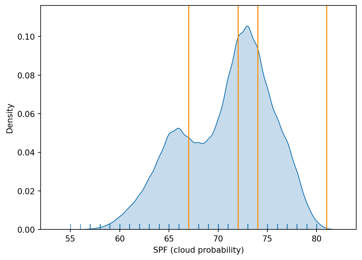
Fisher-Jenks
Equal interval and quantiles are only two examples of very many classification schemes to encode values into colors. As an example of a more sophisticated one, let us create a Fisher-Jenks choropleth.
fig, ax = plt.subplots(figsize=(9, 11)) # Increase the map size
# Plotting the GeoDataFrame `spf_filtered` on the `ax` axes
spf_filtered.plot(
column="cloud_probability", # Specify the column to be visualized
legend=True, # Add a legend to the map
scheme="fisher_jenks", # Use Fisher-Jenks classification for the color scheme
k=7, # Divide the data into 7 intervals
cmap="Blues", # Use the Blues colormap for coloring the map
legend_kwds={
'loc': 'center left', # Position the legend in the center left of the map
'bbox_to_anchor': (1.00, 0.2), # Anchor the legend at this position (right of the plot)
'fontsize': 10 # Set the font size of the legend text
},
edgecolor='grey', # Add grey contours around each geographical feature
linewidth=0.1, # Adjust the thickness of the contours (optional)
ax=ax # Specify the axes object to plot on
)
ax.set_axis_off()
ax.set_title("SPF 2025: Fisher-Jenks Classification", fontweight="bold")
# Adjust the subplot parameters to give more space for the legend
plt.subplots_adjust(right=0.70) # Increase right space to accommodate a larger map
# Show the plot
plt.show()
The same classification can be obtained with a similar approach as before:
classi = mapclassify.FisherJenks(spf_filtered["cloud_probability"], k=7)
classiFisherJenks
Interval Count
----------------------
[55.00, 63.00] | 3123
(63.00, 66.00] | 6594
(66.00, 69.00] | 6399
(69.00, 72.00] | 10976
(72.00, 74.00] | 9423
(74.00, 76.00] | 6014
(76.00, 81.00] | 4315Once we have classified the variable, we can check the actual break points where values stop being in one class and become part of the next one:
classi.binsarray([63., 66., 69., 72., 74., 76., 81.])Now let’s look at the density plot
# Set up the figure
f, ax = plt.subplots(1)
# Plot the kernel density estimation (KDE)
sns.kdeplot(spf_filtered["cloud_probability"], fill=True)
# Add a blue tick for every value at the bottom of the plot (rugs)
sns.rugplot(spf_filtered["cloud_probability"], alpha=0.5)
# Loop over each break point and plot a vertical red line
for cut in classi.bins:
    plt.axvline(cut, color='darkorange', linewidth=1.25)
ax.set_xlabel("SPF (cloud probability)")
# Display image
plt.show()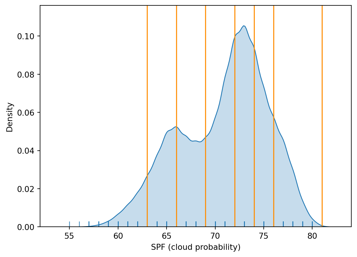
For example, the bins at the extremes of the distribution cover a much wider span than those in the middle, because there are fewer small areas in those value ranges.
You will notice a lot cooler difference once you play around with a larger dataset.
Zooming into the map
A general map of an entire region, or urban area, can sometimes obscure local patterns because they happen at a much smaller scale that cannot be perceived in the global view. One way to solve this is by providing a focus of a smaller part of the map in a separate figure. Although there are many ways to do this in R, the most straightforward one is to define the bounding box.
As an example, let us zoom into Wales — which, per the SPF map above, stands out with generally higher cloud probability than the rest of the UK. Rather than hardcoding coordinates (which depend on knowing the exact CRS of the data), we compute the bounding box directly from the nation subset we already created:
Zoom into full map
# Get the bounding box of Wales directly from the data --
# this works regardless of which CRS the file happens to be in
wales = spf_25[spf_25["nation"] == "Wales"]
minx, miny, maxx, maxy = wales.total_bounds

# Setup the figure
f, ax = plt.subplots(1, figsize=(8, 9))
# Draw the choropleth
spf_25.plot(
    column="cloud_probability",
    cmap="Blues",
    legend=True,
    ax=ax
)
# Redimensionate X and Y axes to Wales's bounds
ax.set_xlim(minx, maxx)
ax.set_ylim(miny, maxy)
ax.set_axis_off()
ax.set_title("SPF 2025: Zoomed into Wales", fontweight="bold")

# Display image
plt.show()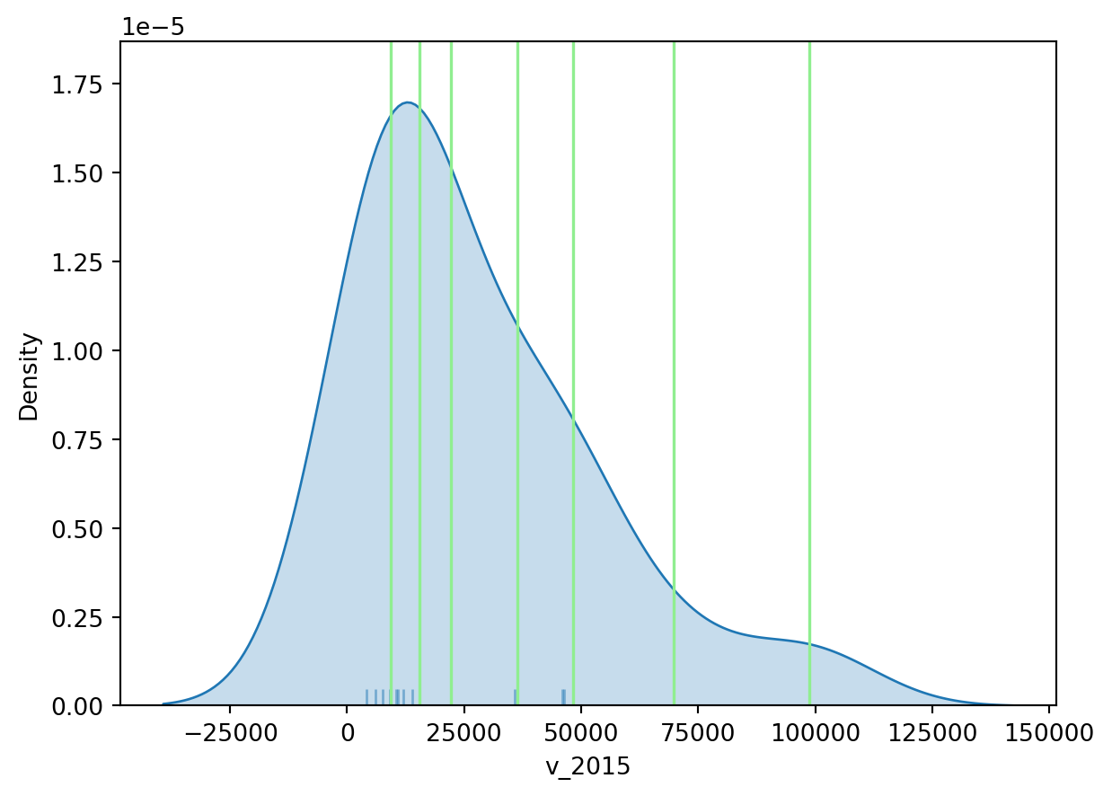
Putting it all together: a publication-ready map
The four maps above were deliberately rough — the point was to show the classification mechanics, not to produce a finished product. A map intended for a report or publication needs a few more cartographic elements: a clear title, a colour scheme chosen on purpose, a north arrow, a scale bar, and a source credit.
For the colour scheme, we’ll switch to viridis — a perceptually uniform, colourblind-safe palette, and a deliberate change from the Blues used throughout this lab, to show that the choice of palette is independent of the choice of classification.
For the north arrow and scale bar, we’ll use matplotlib-map-utils, which handles both and is CRS-aware — it works out the correct orientation and distance regardless of what projection spf_filtered happens to be in, the same “don’t hardcode it, derive it from the data” principle we used for the zoom above.
from matplotlib_map_utils.core.north_arrow import north_arrow
from matplotlib_map_utils.core.scale_bar import scale_bar

fig, ax = plt.subplots(figsize=(9, 11))

spf_filtered.plot(
    column="cloud_probability",  # continuous fill -- no scheme/k here, a full gradient rather than discrete bins
    cmap="viridis_r",
    legend=True,
    legend_kwds={'label': "SPF (cloud probability)", 'shrink': 0.5},
    edgecolor='white',
    linewidth=0.1,
    ax=ax,
)

ax.set_axis_off()
ax.set_title("Sun Probability Framework, UK, 2025", fontsize=16, fontweight="bold")

# North arrow -- orientation calculated from the data's own CRS
north_arrow(ax, location="upper right", rotation={"crs": spf_filtered.crs, "reference": "center"})

# Scale bar -- distance calculated from the data's own CRS, handles projected or geographic data automatically
scale_bar(ax, location="lower right", style="boxes", bar={"projection": spf_filtered.crs})

# Source credit
ax.annotate(
    "Source: Imago Data Service, Sun Probability Framework 2025",
    xy=(0.01, 0.01), xycoords="axes fraction",
    fontsize=8, color="grey"
)

plt.tight_layout()
plt.show()
/Users/pietrost/miniconda3/lib/python3.11/site-packages/matplotlib_map_utils/validation/north_arrow.py:180: UserWarning: A value for degrees was supplied; values for crs, reference, and coords will be ignored
warnings.warn("A value for degrees was supplied; values for crs, reference, and coords will be ignored")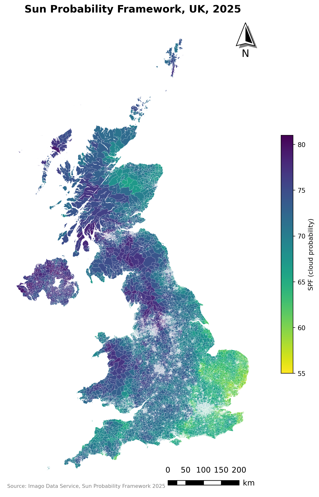
Tip
matplotlib-map-utils isn’t installed by default — pip install matplotlib-map-utils if you don’t have it. It’s actively maintained and is the approach recommended in geopandas’ own documentation for adding both a north arrow and a scale bar in one package; matplotlib-scalebar is a lighter-weight alternative if you only need the scale bar.
Additional resources
On Drawing beautiful choropleths.html with
Pythonandggplotsee hereIf you want to have a look at Choropleths in Python have a look at the chapter on choropleth mapping by Rey, Arribas-Bel and Wolf
Some more on mapping here
TipWant to go further with Imago data?
The SPF dataset we used in this lab is one of several openly available products from Imago, the imagery data service for sustainability, prosperity and wellbeing, part of Smart Data Research UK. They publish their own training materials, free and openly licensed:
Imago training — the full set, covering air temperature, precipitation and SPF, in both
RandPython. Several come with notebooks you can run straight in your browser, no installation needed.From grids to areas — start here if you’re curious where a dataset like SPF actually comes from. It walks through how raw satellite imagery becomes neighbourhood-level statistics: spectral bands, resolution and revisit cycles, then the four-stage pipeline from noisy cloud-covered grid → cleaned composite → modelled indicator → values aggregated to LSOAs.
SPF: Sun Probability Framework and Comparing 2024 and 2025 — more on the specific dataset you’ve just been mapping, including a worked example across multiple years.
Worth a look if you’re thinking about using Earth observation data in your own assignment or dissertation.