library(ggplot2)Warning: package 'ggplot2' was built under R version 4.4.3The lecture’s slides can be found here.
ggplot2 Functions and ArgumentsFor this session you need the following libraries:
install.packages(c("ggplot2", "dplyr", "tidyr", "kableExtra", "ggridges", "RColorBrewer", "broom", "scales", "corrplot", "vtable"))
If necessary install them by moving the line into a code chunk.
The ggplot2 package in R is one of the most powerful tools for creating publication-quality visualisations. It uses a layered approach to building plots, starting with data, then adding mappings, geometries, and other components.
A ggplot2 plot is built step by step:
ggplot(data, aes(x = <X-axis variable>, y = <Y-axis variable>, <other aesthetics>)) +
 <geom_function()> +
 <scales/themes/other layers>
ggplot()data: A data frame containing the variables to be plotted.aes(): Aesthetic mappings to connect data variables to visual properties like x, y, color, fill, size, etc.library(ggplot2)Warning: package 'ggplot2' was built under R version 4.4.3Example:
Let’s load the data first:
census_data <- read.csv("../data/Census2021/EW_DistrictPercentages.csv")Plotting Number of residents vs age (mean).
ggplot(data = census_data, aes(x = Residents, y = mean_age)) +
 geom_point()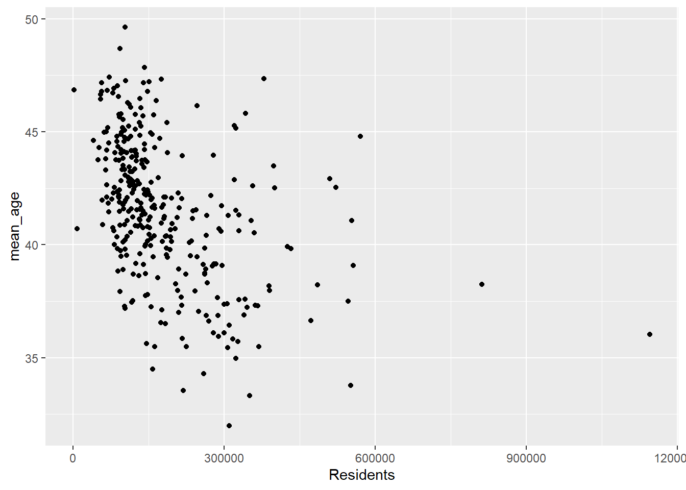
You can plot the following geometries in ggplot:
| Geometry | Function | Use Case |
|---|---|---|
| Point | geom_point() |
Scatterplots |
| Line | geom_line() |
Line plots |
| Bar | geom_bar() |
Bar charts |
| Histogram | geom_histogram() |
Histograms |
| Boxplot | geom_boxplot() |
Boxplots |
| Density | geom_density() |
Density plots |
| Smooth | geom_smooth() |
Add regression or smoothing lines |
Example: Scatterplot with geom_point()
ggplot(census_data, aes(x = Residents, y = mean_age, color = factor(Region))) +
 geom_point(size = 3)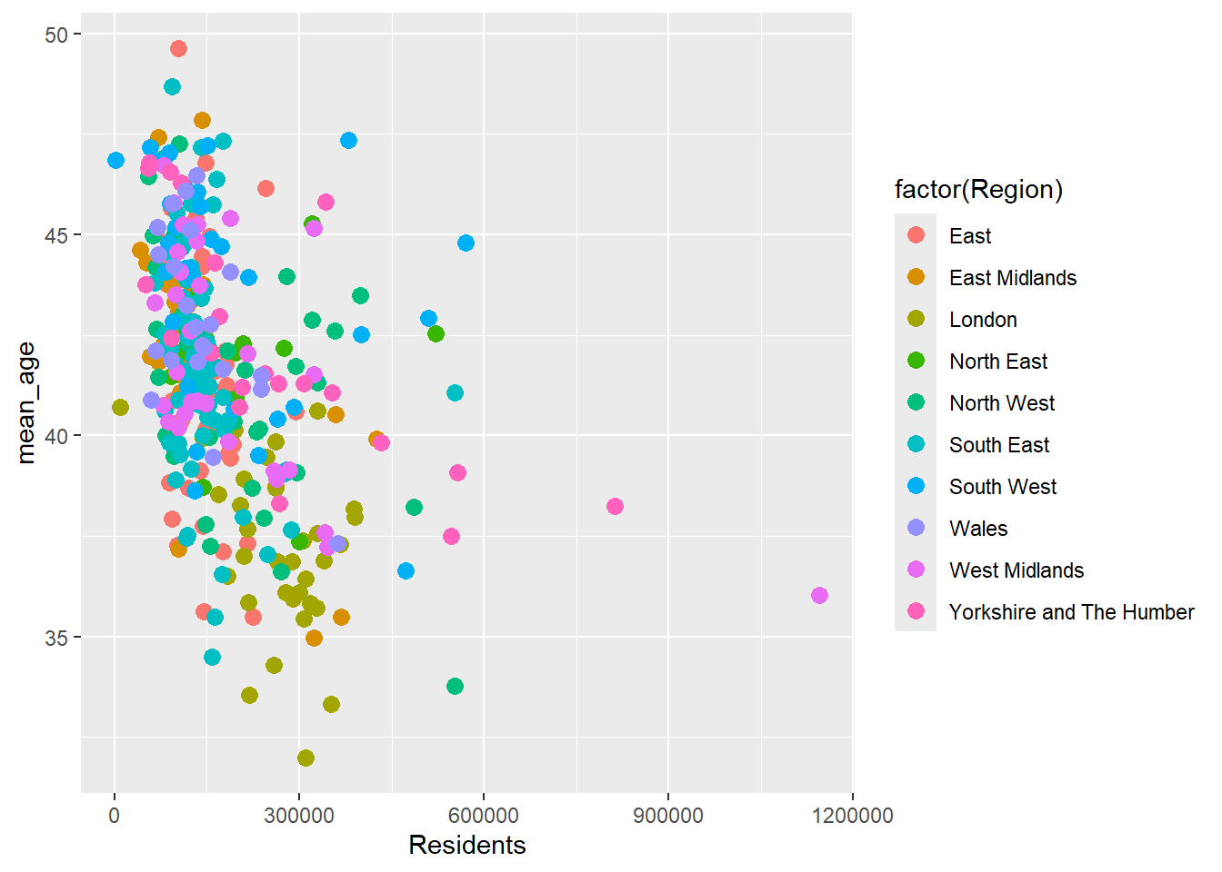
aes()x: X-axis variable.y: Y-axis variable.color: Changes point/line colors based on a variable.fill: Fills bars/areas based on a variable.size: Controls the size of points/lines.Example: Adding color and size aesthetics
ggplot(census_data, aes(x = Residents, y = mean_age, color = factor(Region), size = pct_Very_bad_health)) +
 geom_point()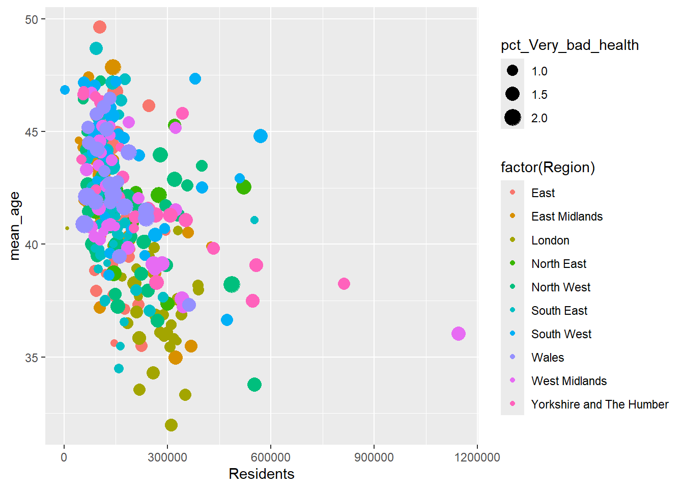
What’s missing in the plot above?How can this be improved?
facet_*Faceting splits data into subsets and creates multiple small plots.
| Function | Description |
|---|---|
facet_wrap(~var) |
Wraps plots across rows/columns. |
facet_grid(row ~ col) |
Creates a grid layout for plots. |
Faceting in is a technique to create multiple plots based on subsets of your data. It is particularly useful for comparing relationships or distributions across categories. By breaking down a dataset into smaller pieces according to a categorical variable, faceting helps visualise data trends or differences within subgroups. For instance, facet_wrap(~ Region) creates individual plots for each category in the Region variable, aligning them into rows and columns. Alternatively, facet_grid(row ~ col) creates a more structured layout, where two categorical variables determine the rows and columns of the grid.
Faceting is essential when dealing with data that needs to be compared across multiple dimensions. For example, a scatterplot faceted by sex can show how a relationship differs for males and females. Similarly, faceted histograms can reveal differences in the distribution of a variable across categories.
ggplot(census_data, aes(x = Residents, y = mean_age)) +
 geom_point() +
 facet_wrap(~Region)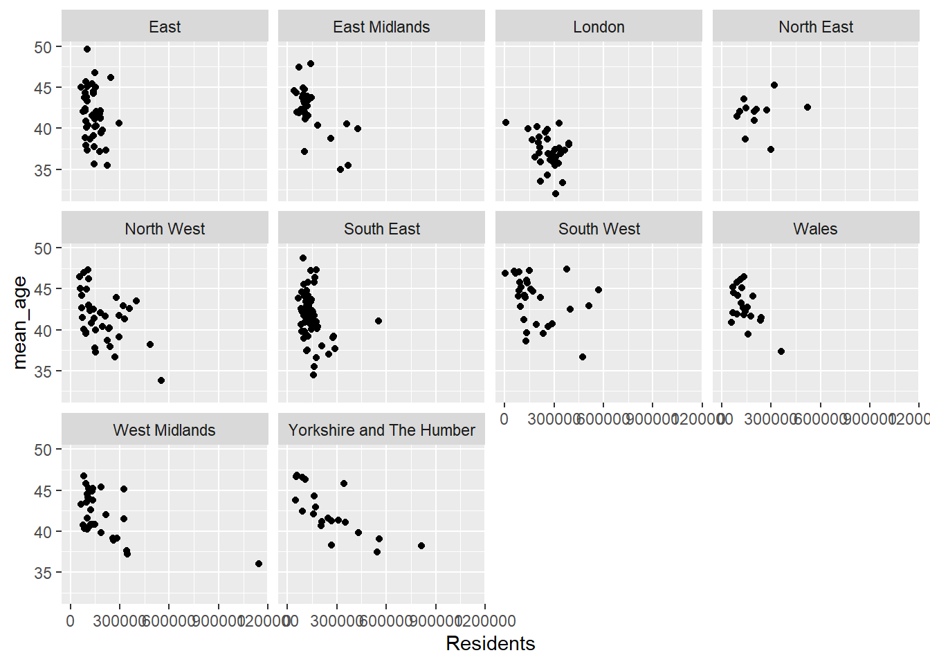
What are the issues here?
theme_*)Themes control the overall appearance of the plot.
| Function | Effect |
|---|---|
theme_minimal() |
Simple and clean theme. |
theme_classic() |
Classic-style plots. |
theme_dark() |
Dark background. |
theme_void() |
Minimal with no axes or grids. |
Applying a theme
ggplot(data = census_data, aes(x = Residents, y = mean_age)) +
 geom_point() +
 theme_void() +
 labs(title = "Visualisation with Void Theme")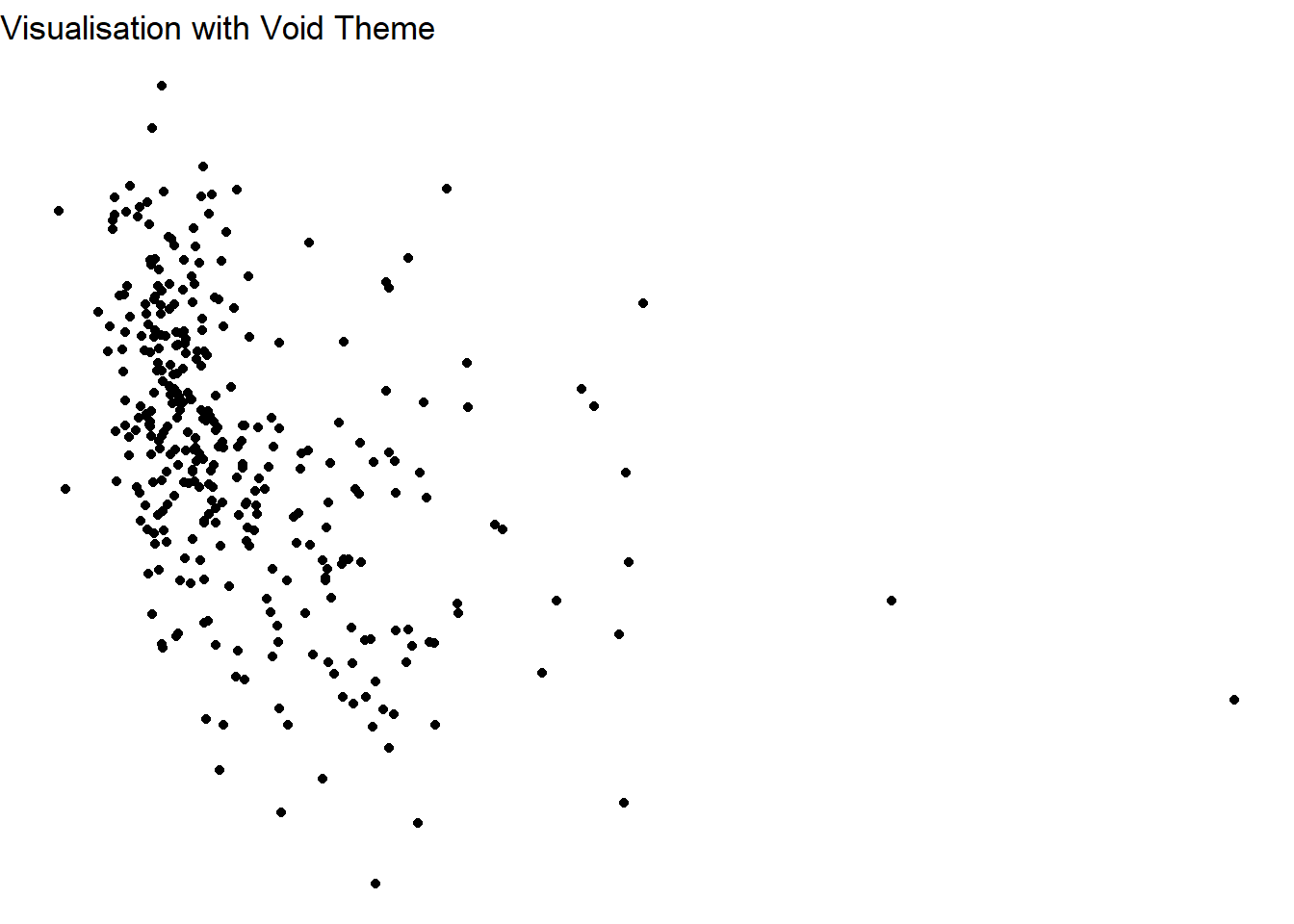
What do you think? Is this any good?
Scales adjust color, size, and axis properties.
| Scale | Description |
|---|---|
scale_color_manual() |
Customizes colors for lines/points. |
scale_fill_brewer() |
Predefined color palettes for fills. |
scale_x_continuous() |
Modifies X-axis properties. |
scale_y_continuous() |
Modifies Y-axis properties. |
scale_color functions modify the outline color of elements like points, lines, or the border of shapes, while scale_fill functions modify the interior fill color of shapes like bars, tiles, or boxes. Both are used to control aesthetics based on a variable mapped in aes() but apply to different visual aspects of the plot.
Example: Customizing axis and colors
The RColorBrewer library provides pre-defined color palettes specifically designed for data visualisation, ensuring clarity and accessibility. It includes sequential, diverging, and qualitative palettes suitable for various data types and visualisation needs.
Have a look at: https://r-graph-gallery.com/38-rcolorbrewers-palettes.html
# Automatically determine the number of colors needed

num_levels <- length(unique(census_data$Region))
The num_levels variable is a dynamic way to determine the number of unique levels in a categorical variable, such as Region. This approach is particularly helpful when you don’t know in advance how many categories exist in the dataset.
The code above calculates the number of unique categories in the Region variable, ensuring that your plot’s color palette matches the data’s requirements. Based on the value of num_levels, you can choose an appropriate color palette from libraries like RColorBrewer. For example:
library(RColorBrewer)
# Use an appropriate Brewer palette based on the number of levels
palette <- if (num_levels <= 8) "Set2" else "Paired" # Choose a palette with enough colors
This dynamically selects a palette suitable for the number of categories. If there are 8 or fewer levels, the Set2 palette is used; for more levels, Paired ensures enough distinct colors (there’s several palettes, check the link above for more).
When applying the palette in ggplot2, the functionscale_color_brewer(palette = palette) ensures that the plot assigns colors based on the selected scheme. This process avoids hardcoding colors or palettes and ensures the plot adapts to changes in the data, such as when categories are added or removed.
ggplot(census_data, aes(x = Residents, y = mean_age, color = factor(Region))) +
 geom_point(size = 3) +
 scale_color_brewer(palette = palette) + # Dynamically chosen palette
 scale_x_continuous(breaks = seq(50, 350, 50)) +
labs(title = " Write a title") 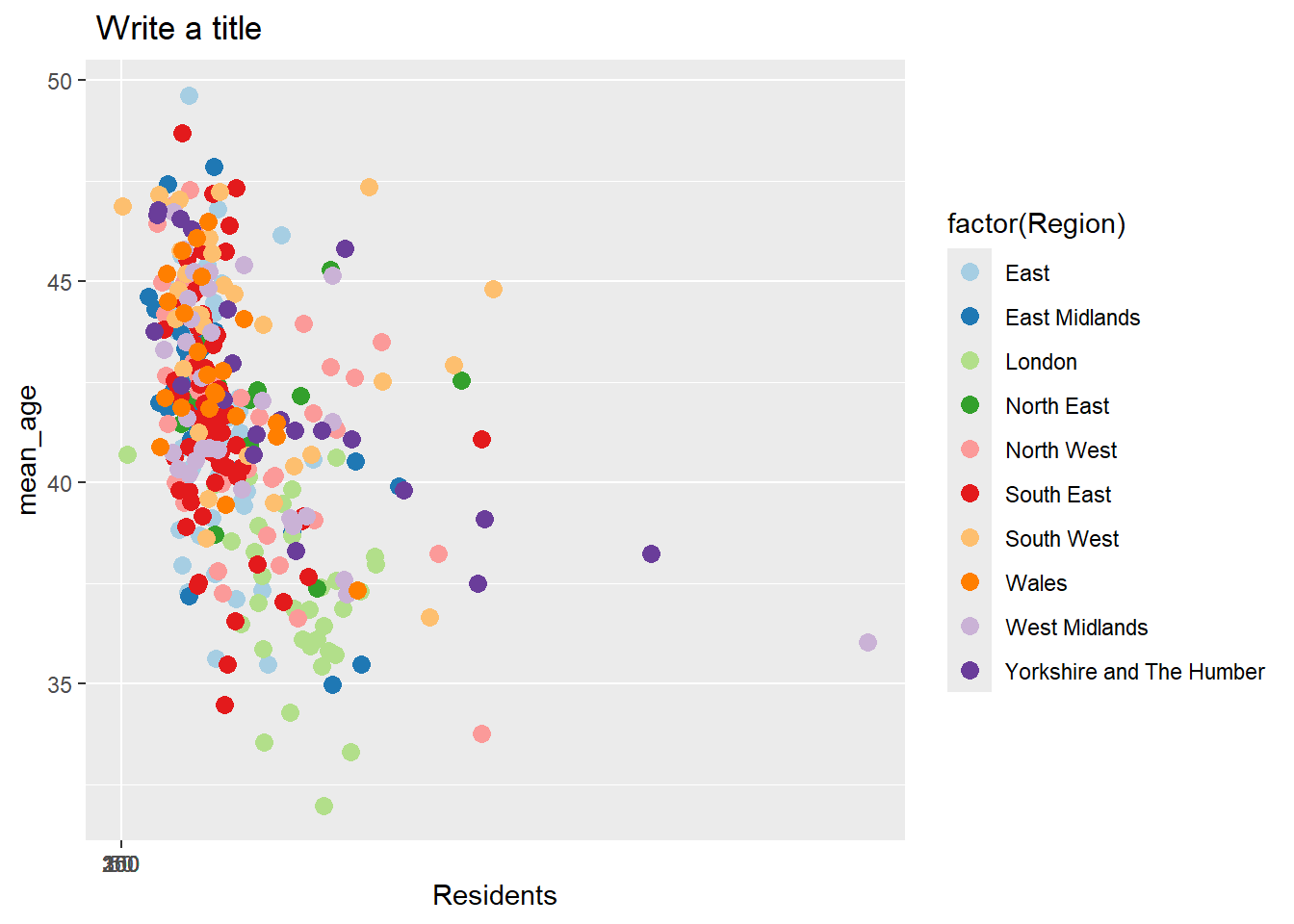
You can also create your own palette of colours.
ggplot(census_data, aes(x = Residents, y = mean_age, color = factor(Region))) +
 geom_point(size = 3) +
 scale_color_manual(values = c("red", "blue", "green", "purple", "orange", "pink", "brown", "yellow", "gray", "skyblue")) +
 labs(
  title = "Scatterplot of Residents vs Mean Age by Region",
  x = "Residents",
  y = "Mean Age",
  color = "Region"
 ) +
 theme_minimal()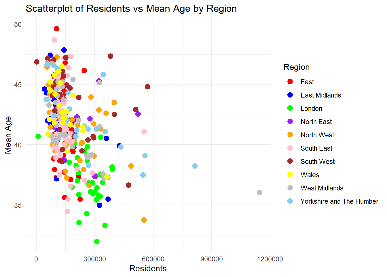
Consider in general, that there’s several functions associated to scales
| Category | Function | Description | Example Usage |
|---|---|---|---|
| Discrete Color Scales | scale_color_brewer() |
Use pre-defined discrete palettes from RColorBrewer. | scale_color_brewer(palette = "Set1") |
scale_fill_brewer() |
Fill colors for discrete variables from RColorBrewer. | scale_fill_brewer(palette = "Pastel2") |
|
scale_color_manual() |
Manually assign colors for discrete variables. | scale_color_manual(values = c("red", "blue", "green")) |
|
scale_fill_manual() |
Manually assign fill colors for discrete variables. | scale_fill_manual(values = c("purple", "orange", "yellow")) |
|
scale_color_viridis_d() |
Use discrete palettes from the viridis package (colorblind-friendly). | scale_color_viridis_d(option = "plasma") |
|
scale_fill_viridis_d() |
Fill discrete variables with viridis palettes. | scale_fill_viridis_d(option = "cividis") |
|
| Continuous Color Scales | scale_color_gradient() |
Two-color gradient for continuous variables. | scale_color_gradient(low = "blue", high = "red") |
scale_fill_gradient() |
Two-color gradient for continuous fill variables. | scale_fill_gradient(low = "green", high = "yellow") |
|
scale_color_gradient2() |
Diverging gradient with a midpoint for continuous variables. | scale_color_gradient2(low = "blue", mid = "white", high = "red", midpoint = 0) |
|
scale_fill_gradient2() |
Diverging gradient with a midpoint for continuous fill variables. | scale_fill_gradient2(low = "purple", mid = "gray", high = "orange", midpoint = 50) |
|
scale_color_gradientn() |
Multi-color gradient for continuous variables. | scale_color_gradientn(colors = c("blue", "green", "yellow", "red")) |
|
scale_fill_gradientn() |
Multi-color gradient for continuous fill variables. | scale_fill_gradientn(colors = c("lightblue", "white", "pink")) |
|
scale_color_viridis_c() |
Continuous color scales from viridis. | scale_color_viridis_c(option = "magma") |
|
scale_fill_viridis_c() |
Continuous fill scales from viridis. | scale_fill_viridis_c(option = "inferno") |
|
| Axis Scales | scale_x_continuous() |
Customize numeric X-axis with limits and breaks. | scale_x_continuous(limits = c(0, 100), breaks = seq(0, 100, 10)) |
scale_y_continuous() |
Customize numeric Y-axis with limits and labels. | scale_y_continuous(labels = scales::percent_format()) |
|
scale_x_log10() |
Logarithmic transformation for X-axis. | scale_x_log10() |
|
scale_y_log10() |
Logarithmic transformation for Y-axis. | scale_y_log10() |
|
scale_x_reverse() |
Reverse the X-axis direction. | scale_x_reverse() |
|
scale_y_reverse() |
Reverse the Y-axis direction. | scale_y_reverse() |
|
| Shape and Size Scales | scale_shape_manual() |
Manually assign shapes to categories for points. | scale_shape_manual(values = c(19, 17, 15)) |
scale_size_continuous() |
Scale the size of points based on a continuous variable. | scale_size_continuous(range = c(1, 10)) |
|
scale_size_manual() |
Manually specify point sizes for categorical variables. | scale_size_manual(values = c(2, 4, 6)) |
labs(): Adds labels for axes, title, and legend.coord_flip(): Flips X and Y axes for horizontal plots.Labeling:
# labels
labs(
 title = "Plot Title",
 x = "X-Axis Label",
 y = "Y-Axis Label",
 color = "Legend Title"
)
<ggplot2::labels> List of 4
$ x : chr "X-Axis Label"
$ y : chr "Y-Axis Label"
$ colour: chr "Legend Title"
$ title : chr "Plot Title"Flipping:
# flipping
ggplot(census_data, aes(x = factor(Region), y = Residents)) +
 geom_boxplot() +
 coord_flip() +
 labs(title = "Horizontal Boxplot")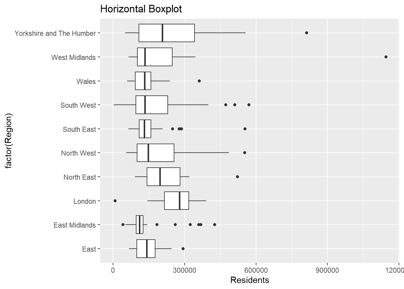
Key Tips for ggplot2:
+).theme_minimal(), theme_classic()) to clean up your plots.RColorBrewer or viridis for colorblind-friendly options.This section demonstrates how to create publication-quality visualisations in R using ggplot2.
Learning goals Developing an understanding of, and ability to create academic standard data visualisations.
Let’s load the datasets first Check the paths, you may need to remove the “..”
frs_data <- read.csv("../data/FRS/FRS16-17_labels.csv")
census_data <- read.csv("../data/Census2021/EW_DistrictPercentages.csv")Histogram
ggplot(census_data, aes(x = pct_Age_20_to_29)) +
 geom_histogram(bins = 5, fill = "steelblue", color = "black") +
 labs(title = "Distribution of Numerical Variable", x = "Variable", y = "Count") +
 theme_minimal()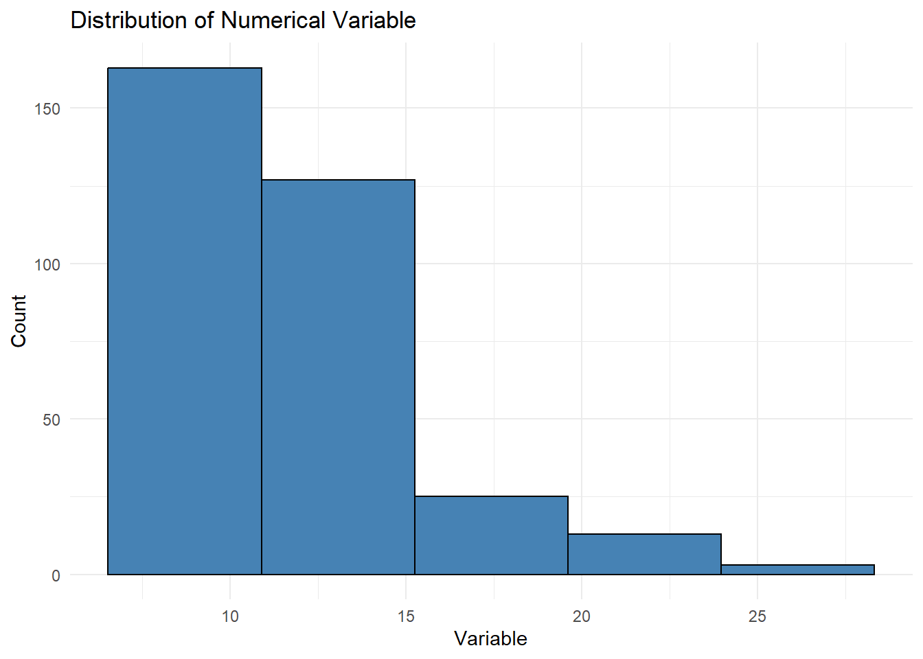
The bins parameter in a histogram determines the number of intervals (bins) into which the data range is divided. Each bin represents a range of values along the x-axis, and the height of each bar shows the count of observations within that range. For example, if bins = 5, the data is divided into five equal-width intervals. Using fewer bins results in a coarser view of the data, while more bins provide a finer, more detailed representation. However, too many bins can make the histogram appear cluttered and difficult to interpret. The width of each bin is automatically calculated by dividing the range of the data by the number of bins.
Density Plot
ggplot(census_data, aes(x = Residents)) +
 geom_density(fill = "lightblue", alpha = 0.7) +
 labs(title = "Residents, Density distribution", x = "Value", y = "Density") +
 theme_minimal()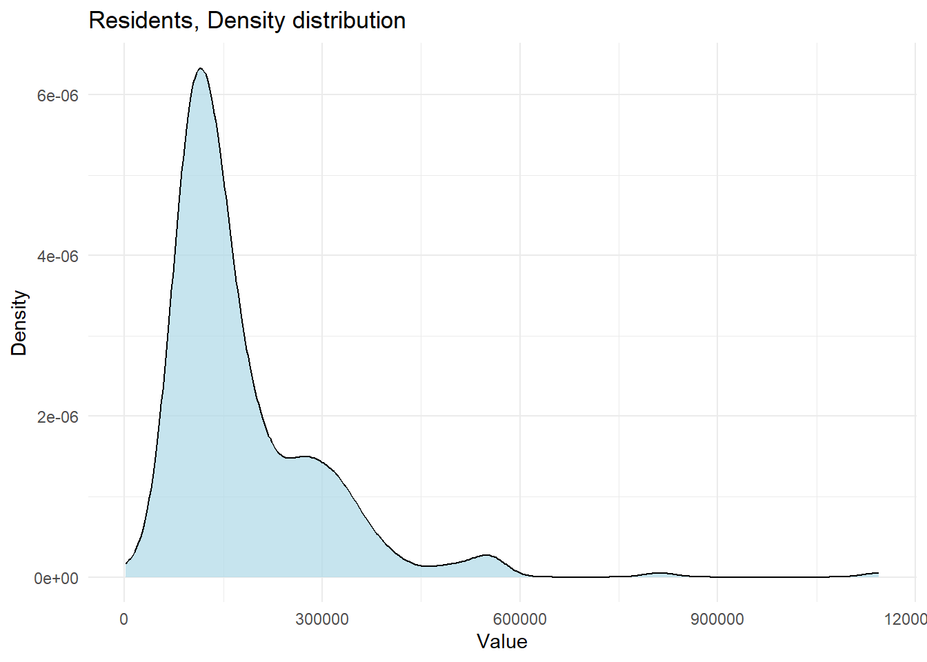
Histogram + Density Distribution
# Plot histogram with density overlay for a chosen variable (e.g., 'pct_No_qualifications')
ggplot(census_data, aes(x = pct_No_qualifications)) +
    geom_histogram(aes(y = after_stat(density)), bins = 10, color = "black", fill = "skyblue", alpha = 0.7) +
    geom_density(color = "darkblue", linewidth = 1) +
    labs(title = "Distribution of pct_No_qualifications", x = "Value", y =  "Density") +
 theme_minimal()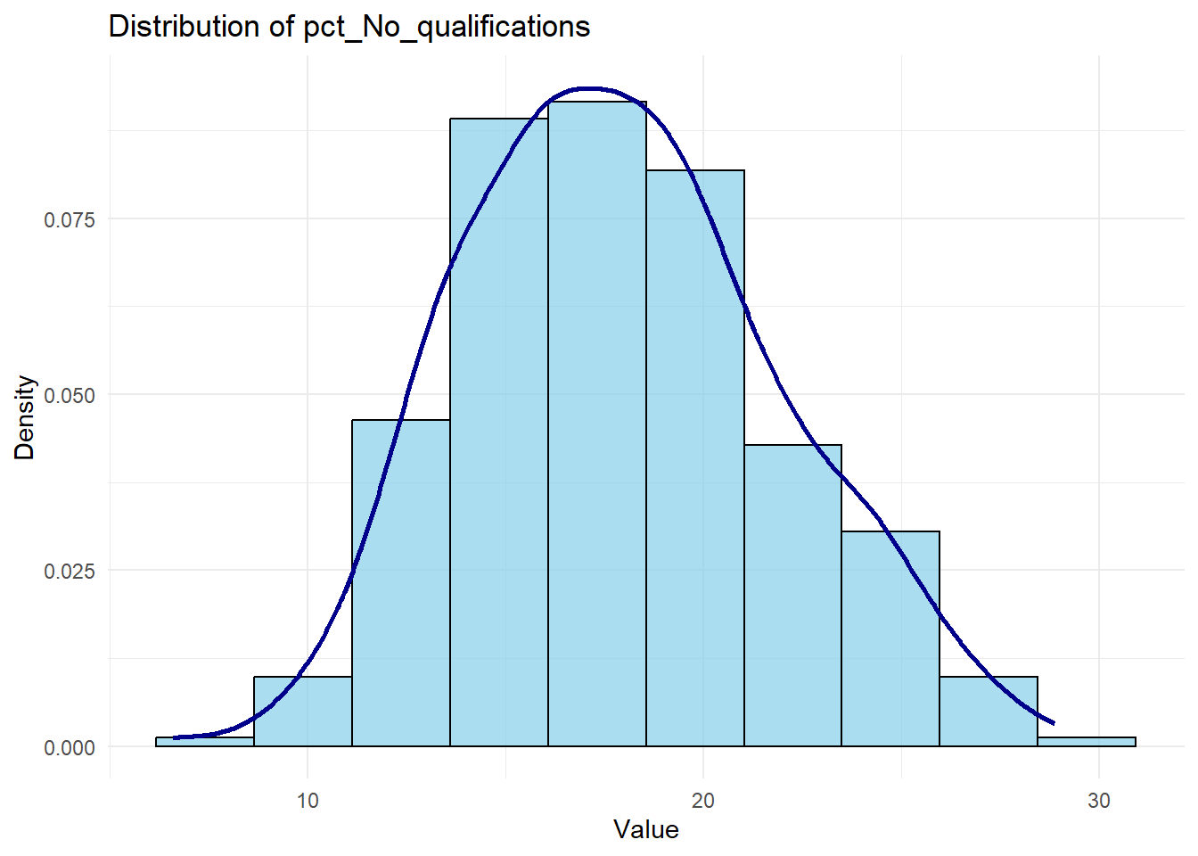
Box Plot
A box plot, also known as a box-and-whisker plot, is a graphical representation of the distribution of a dataset. It displays the minimum, first quartile (Q1), median (Q2), third quartile (Q3), and maximum values, with the central box representing the interquartile range (IQR) from Q1 to Q3. The whiskers extend from the box to show the range of the data, excluding outliers. Outliers are typically represented as individual points outside the whiskers.
The box plot provides a concise summary of the data distribution, highlighting the spread, center, and potential skewness.
library(scales) # For label_comma()Warning: package 'scales' was built under R version 4.4.3ggplot(census_data, aes(y = Residents)) +
geom_boxplot(fill = "lightgreen", color = "black") +
labs(title = "Residents Distribution", y = "Number of Residents") +
theme_minimal() +
scale_y_continuous(
limits = c(0, 500000),
labels = label_comma() # Properly placed within scale_y_continuous()
)Warning: Removed 9 rows containing non-finite outside the scale range
(`stat_boxplot()`).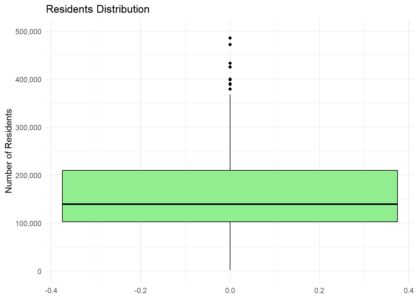
# Setting axis limits for better readability and applying comma-separated format to large numbers.This looks kind of sad with just one variable, but it’s the best way, usually, to plot distributions for numerical variables.
Notice the outliers. Outliers are data points that deviate significantly from the overall pattern of a dataset. They can arise due to measurement errors, variability in the data, or the presence of extreme values. Outliers can heavily influence statistical analyses, such as means or regression models, potentially leading to misleading conclusions. Identifying and addressing outliers is crucial to ensure robust and accurate results. Boxplots allow spotting them, along with interquartile range (IQR) analysis.
Bar Chart
ggplot(frs_data, aes(x = highest_qual)) +
 geom_bar(fill = "skyblue", color = "black") +
 labs(title = "Distribution of 1 Categorical Variable", x = "Highest Educational Qualification", y = "Count") +
 theme_minimal()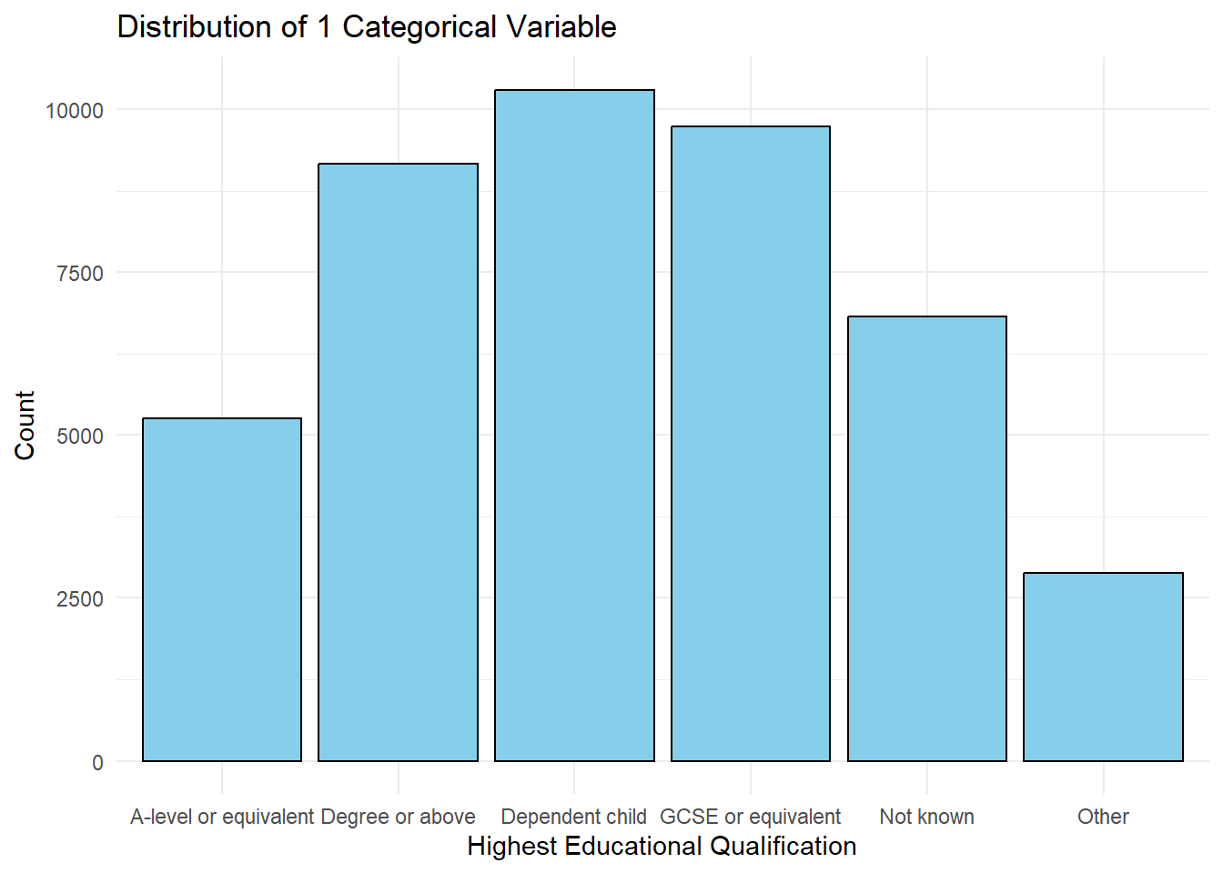
Horizontal Bar Chart
ggplot(frs_data, aes(x = highest_qual)) +
 geom_bar(fill = "lightgreen", color = "black") +
 labs(title = "Horizontal Bar Chart", x = "Highest Educational Qualification", y = "Count", ) +
 coord_flip() + #just flipping
 theme_minimal()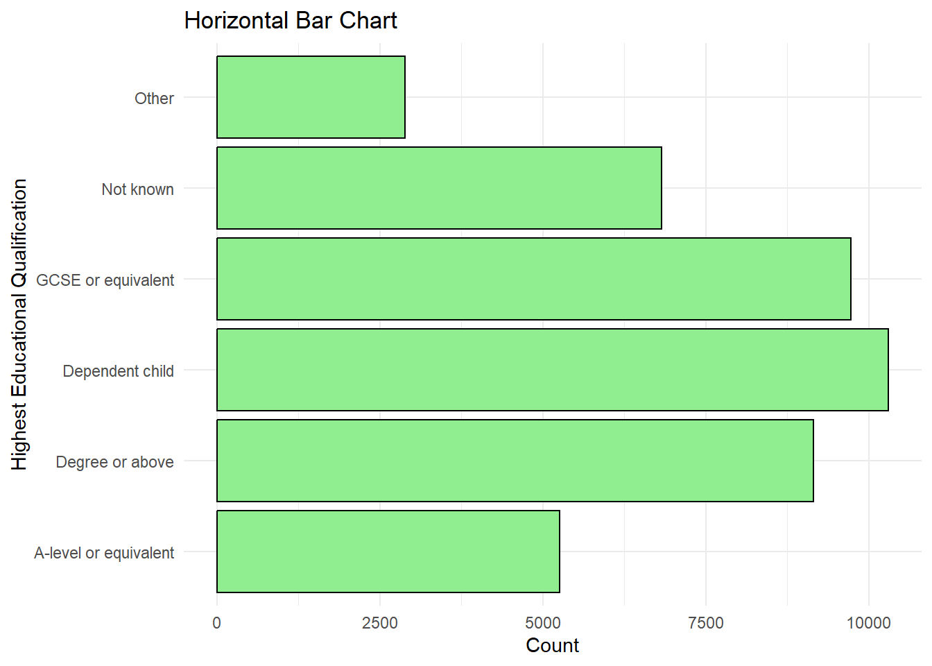
1 numerical, 1 categorical: Boxplot
ggplot(frs_data, aes(x = highest_qual, y = hh_size, fill = highest_qual)) +
 geom_boxplot() +
 labs(
  title = "Household Size by Highest Educational Qualification",
  x = "Highest Educational Qualification",
  y = "Household Size"
 ) +
 theme_minimal() +
 theme(legend.position = "none") # don't need this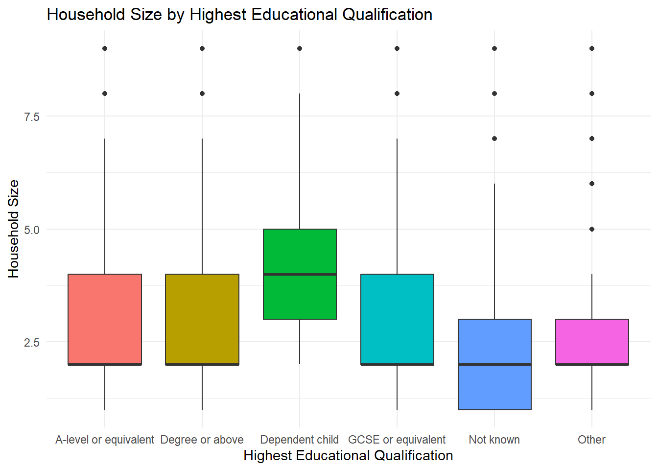
1 numerical, 1 categorical: Density Ridges
library(ggridges) # need a library for thisWarning: package 'ggridges' was built under R version 4.4.2ggplot(frs_data, aes(x = hh_size, y = highest_qual, fill = highest_qual)) +
geom_density_ridges(alpha = 0.7) +
labs(
title = "Household Size Distribution by Highest Qualification",
x = "Household Size",
y = "Highest Qualification"
) +
theme_minimal()Picking joint bandwidth of 0.18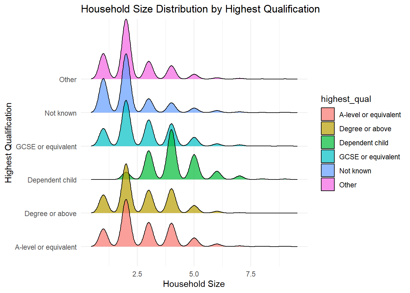
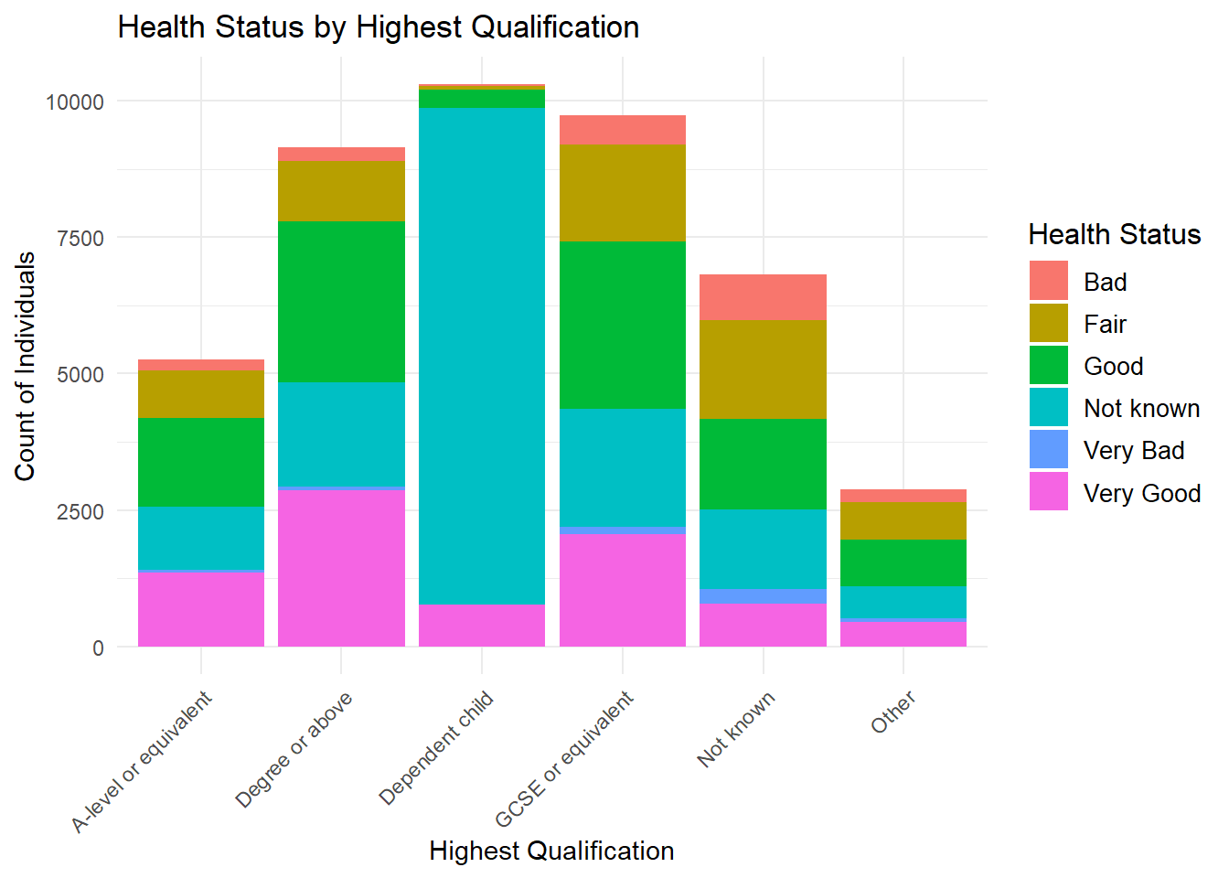
2 Categorical Variables: Stacked Bar Chart
Note the adjustments made for making the labels look better
ggplot(frs_data, aes(x = highest_qual, fill = health)) +
 geom_bar(position = "stack") +
 labs(
  title = "Health Status by Highest Qualification",
  x = "Highest Qualification",
  y = "Count of Individuals",
  fill = "Health Status"
 ) +
 theme_minimal() +
 theme(
  axis.text.x = element_text(angle = 45, hjust = 1), # Rotate X-axis labels for readability
  legend.title = element_text(size = 12),      # Adjust legend title size
  legend.text = element_text(size = 10)       # Adjust legend text size
 )
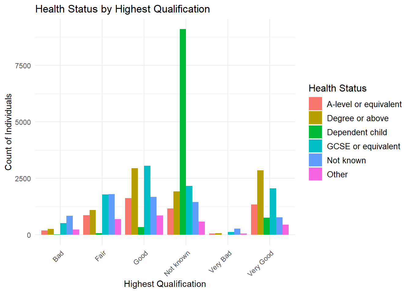
Side-by-Side Bar Chart (Two-Way Frequency Distribution)
This type of chart can get messy.
ggplot(frs_data, aes(x = health, fill = highest_qual)) +
 geom_bar(position = "dodge") +
 labs(
  title = "Health Status by Highest Qualification",
  x = "Highest Qualification",
  y = "Count of Individuals",
  fill = "Health Status"
 ) +
 theme_minimal() +
 theme(
  axis.text.x = element_text(angle = 45, hjust = 1),
  legend.title = element_text(size = 12),
  legend.text = element_text(size = 10)
 )
2 Categorical Variable counts to percentages: Stacked Percentage Graph
One can also convert the counts of two categorical variables to percentages. In this case, we aim to visualise the proportional distribution of one categorical variable (health) across levels of another categorical variable (highest_qual) using a stacked percentage bar chart. First, we create a cross-tabulation to count the occurrences of each combination of Health and Qualification categories. These counts are then converted into a percentage format relative to the total counts for each Qualification category. This transformation allows us to represent the relative proportions rather than absolute counts, facilitating comparison across categories.
A cross tabulation (or contingency table) is a statistical tool used to analyze the relationship between two or more categorical variables. It organizes data into a table format where: - Rows represent the categories of one variable. - Columns represent the categories of another variable. - Cells display the counts or frequencies of data points that fall into each combination of the row and column categories.
# Create a cross-tabulation of observed counts
cross_tab <- table(frs_data$health, frs_data$highest_qual)

# Convert the cross-tabulation to a data frame
cross_tab_df <- as.data.frame(cross_tab)
colnames(cross_tab_df) <- c("Health", "Qualification", "Percentage")
The data is reshaped into a data frame for compatibility with ggplot2, where a stacked bar chart with percentage scaling (position = "fill") is generated. The result is a plot that shows how Health statuses are distributed proportionally within each Qualification level.
# Create a stacked percentage bar chart
ggplot(cross_tab_df, aes(x = Qualification, y = Percentage, fill = Health)) +
 geom_bar(stat = "identity", position = "fill") +
 scale_y_continuous(labels = scales::percent_format()) +
 labs(
  title = "Health by Highest Qualification (Percentage)",
  x = "Highest Qualification",
  y = "Percentage",
  fill = "Health Status"
 ) +
 theme_minimal() +
 theme(axis.text.x = element_text(angle = 45, hjust = 1))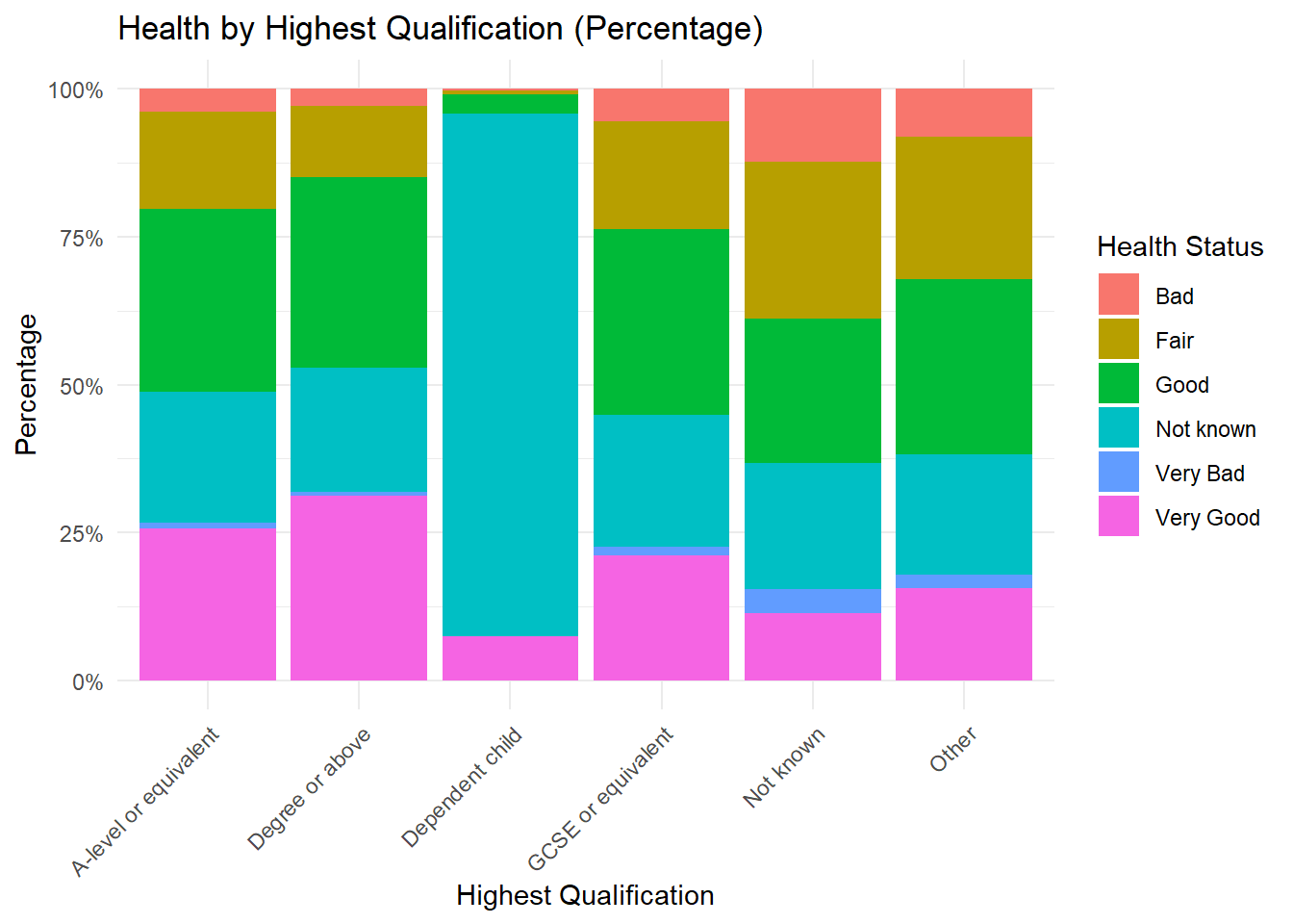
3+ Numerical Variables: Boxplot
To compare three numerical variables using boxplots in ggplot2, one needs to reshape the data to a long format so that each numerical variable is treated as a category in a single column.
Here’s how you can do it, using tidyverse
library(tidyverse) # we need tidyverse for this── Attaching core tidyverse packages ──────────────────────── tidyverse 2.0.0 ──
✔ dplyr 1.1.4 ✔ readr 2.1.5
✔ forcats 1.0.0 ✔ stringr 1.5.1
✔ lubridate 1.9.3 ✔ tibble 3.2.1
✔ purrr 1.0.2 ✔ tidyr 1.3.1
── Conflicts ────────────────────────────────────────── tidyverse_conflicts() ──
✖ readr::col_factor() masks scales::col_factor()
✖ purrr::discard() masks scales::discard()
✖ dplyr::filter() masks stats::filter()
✖ dplyr::lag() masks stats::lag()
ℹ Use the conflicted package (<http://conflicted.r-lib.org/>) to force all conflicts to become errors# Reshape the data into long format
long_data <- census_data %>%
pivot_longer(
cols = c(pct_Single, pct_Muslim, pct_Married_opposite_sex_couple),
names_to = "Variable",
values_to = "Value"
)The code above reshapes the data from a wide format to a long format using the pivot_longer() function from the tidyverse package. In the original dataset, each column represents a separate variable (e.g., pct_Single, pct_Muslim, ..), and their values are stored in individual columns. The transformation collapses these columns into two new columns: one for the variable names (Variable) and another for their corresponding values (Value). This format is useful for plotting or analysis where variables are treated uniformly, such as when creating boxplots or facet grids in ggplot2.
# Create the boxplot
ggplot(long_data, aes(x = Variable, y = Value, fill = Variable)) +
 geom_boxplot() +
 labs(
  title = "Comparison of Three Numerical Variables",
  x = "Variable",
  y = "Value"
 ) +
 theme_minimal() +
 theme(legend.position = "none")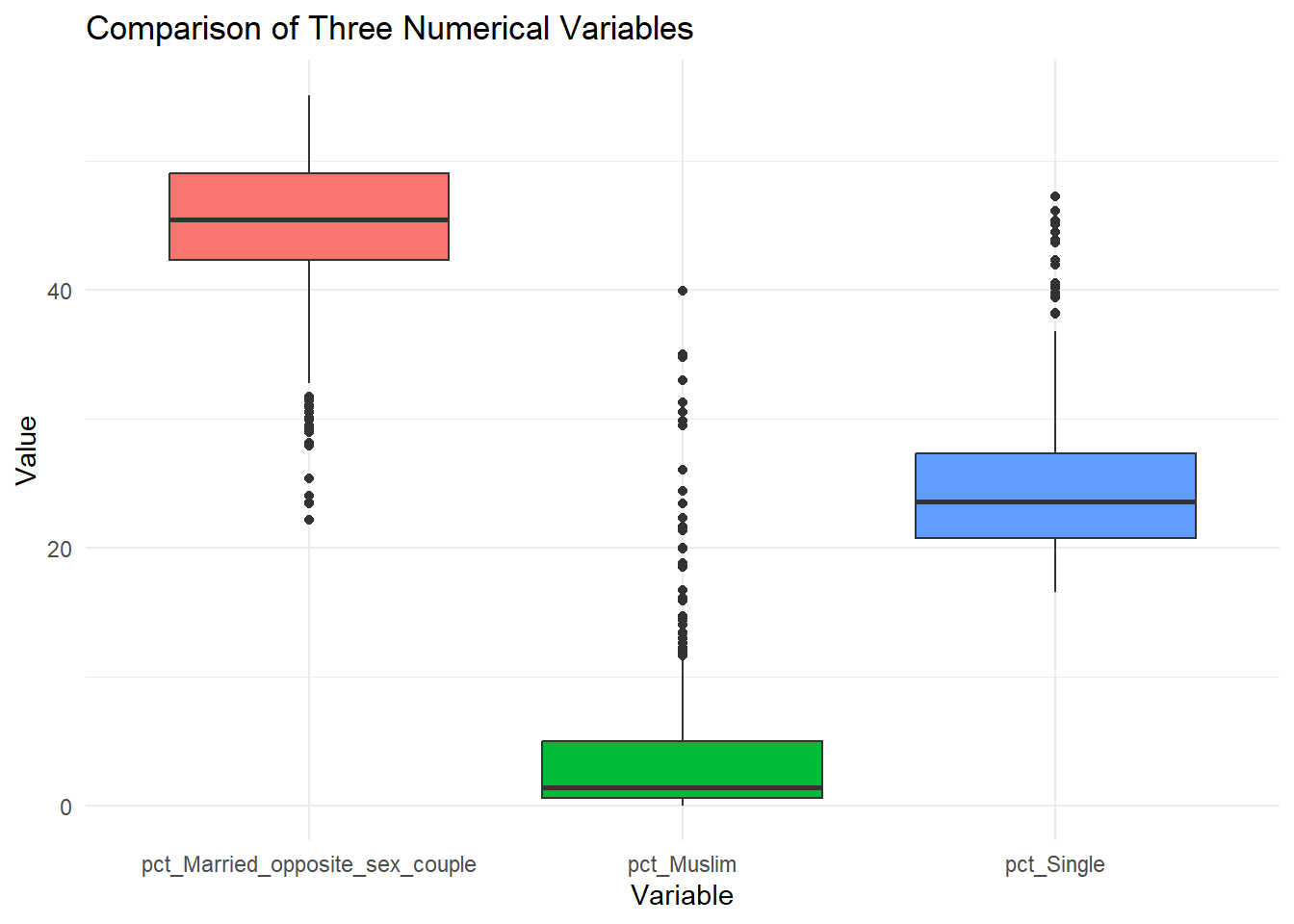
2 Numerical Variables: Scatterplot
ggplot(census_data, aes(x = pct_Single, y = pct_Muslim, color = factor(Country))) +
 geom_point(size = 3, alpha = 0.7) +
 labs(
  title = "Percentage of Single Population vs Muslim Population by Country",
  x = "Percentage of Single Population",
  y = "Percentage of Muslim Population",
  color = "Country"
 ) +
 theme_minimal()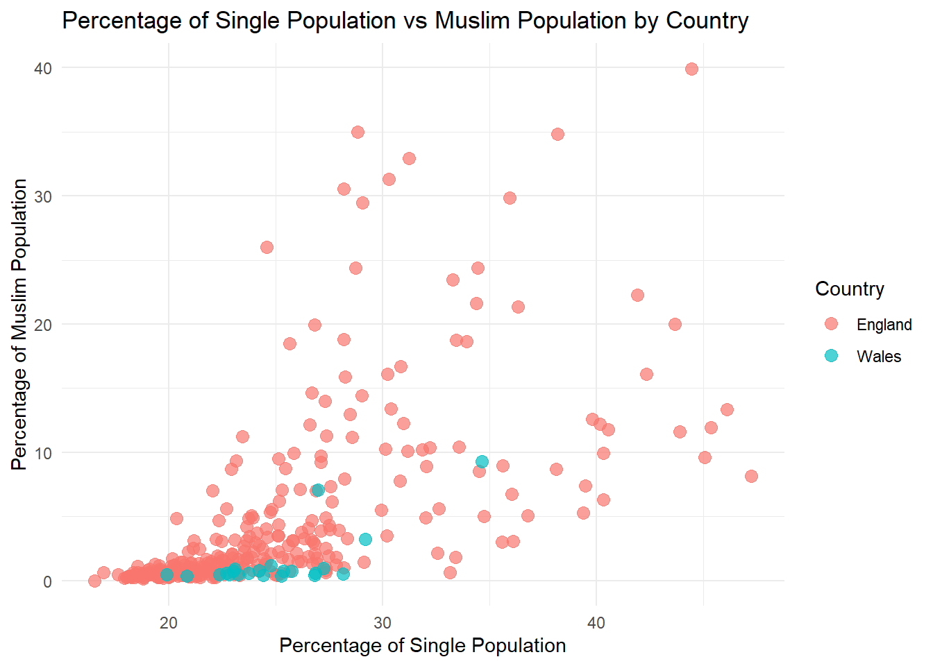
2 Numerical Variables + 1 Catecorical: Scatterplot
ggplot(census_data, aes(x = pct_Single, y = pct_Muslim, color = factor(Region))) +
 geom_point(size = 3, alpha = 0.7) +
 labs(
  title = "Percentage of Single Population vs Muslim Population by Region",
  x = "Percentage of Single Population",
  y = "Percentage of Muslim Population",
  color = "Region"
 ) +
 theme_minimal()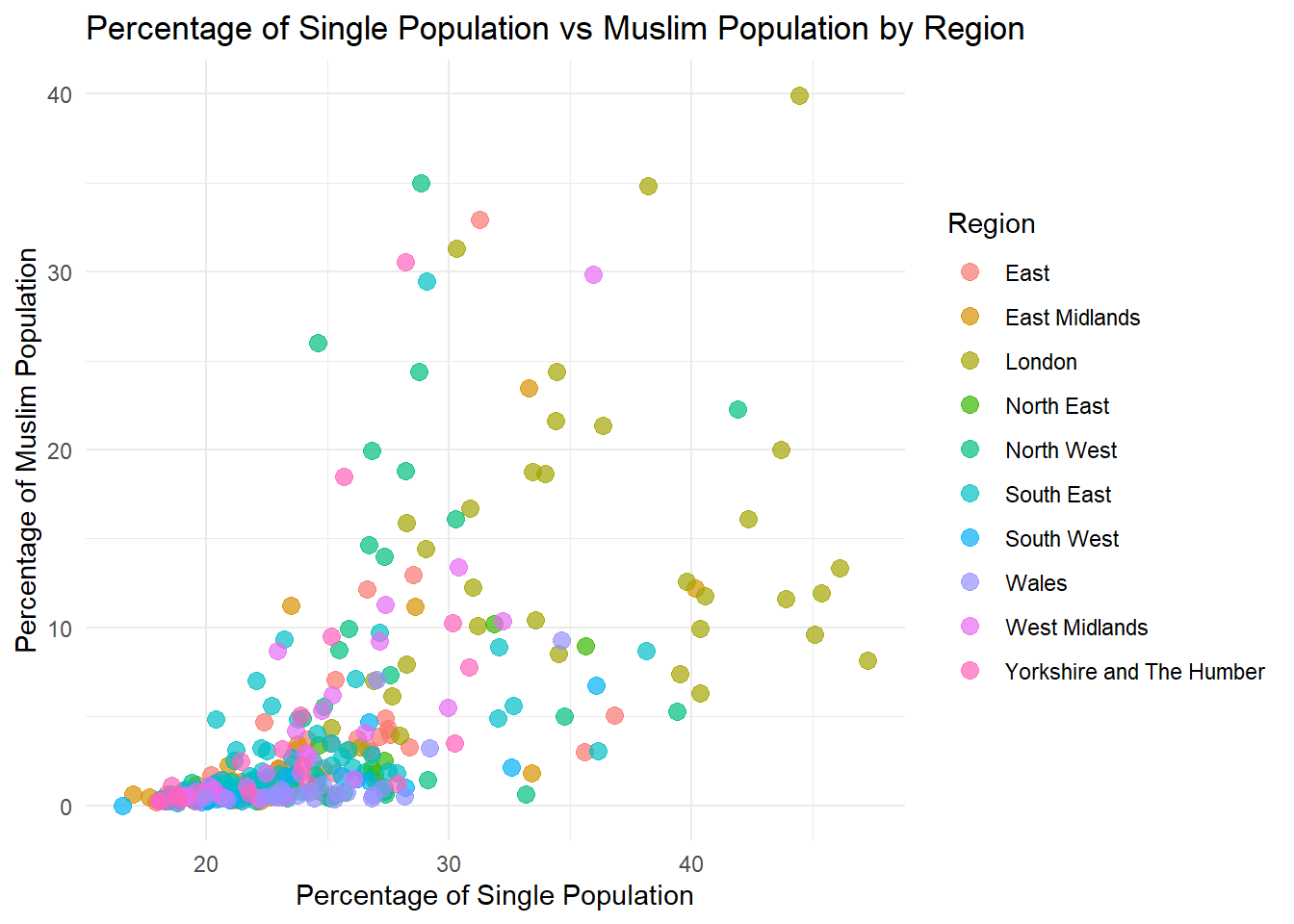
3+ Numerical Variables: Correlogram
A correlogram is a visual representation of a correlation matrix, where the strength and direction of relationships between numerical variables are displayed. The matrix is typically a grid, with variables listed along both the rows and columns. Each cell in the matrix shows the correlation coefficient between two variables.
The library corrplot would do it for us. Check: https://cran.r-project.org/web/packages/corrplot/vignettes/corrplot-intro.html for deeper customisation.
In the corrplot package, a correlogram can use colors, shapes, or numbers to represent the correlation. For example, colors ranging from blue to red often signify negative to positive correlations, while white may indicate no correlation. Similarly, circles or other shapes can vary in size to depict the strength of the relationship. The corrplot function simplifies creating correlograms with customizable options. For example, using method = “number” places correlation coefficients in each cell, while method = “circle” represents correlations graphically.
Correlograms are valuable for quickly identifying patterns or strong relationships between variables, such as spotting which features might influence one another in a dataset
library(corrplot)Warning: package 'corrplot' was built under R version 4.4.2corrplot 0.95 loaded# Select the necessary variables from the dataset
selected_vars <- census_data[, c("pct_Males", "pct_Age_85_and_over", "pct_Bad_health")]
# Calculate the correlation matrix
cor_matrix <- cor(selected_vars, use = "complete.obs")
# Generate the correlation plot
corrplot(cor_matrix,
method = "number", # Display numbers
col = colorRampPalette(c("blue", "white", "red"))(200), # Color gradient
tl.col = "black", # Text color for labels
tl.srt = 45, # Rotate text labels
title = "Correlation Matrix of Selected Variables",
mar = c(0, 0, 1, 0)) # Adjust margins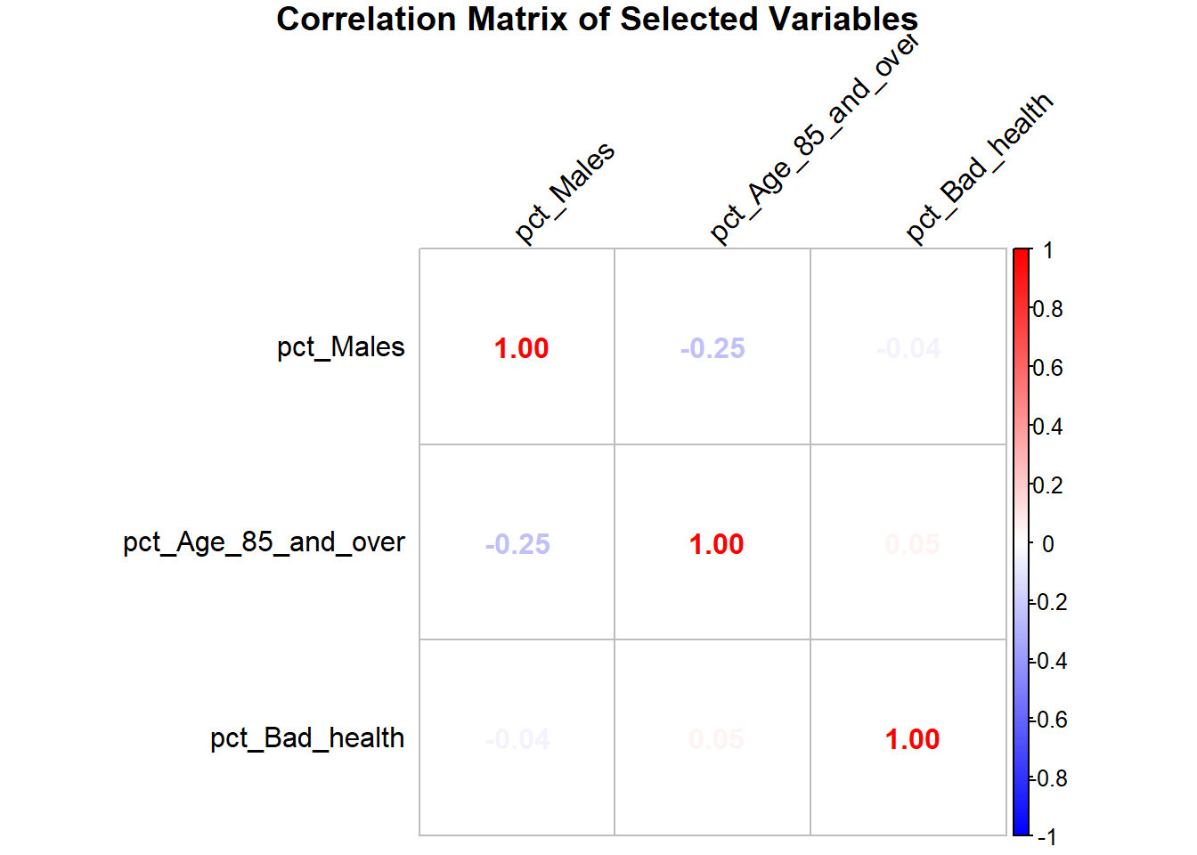
We can also include circles to graphically represent correlations.
# Generate the correlation plot with circles
corrplot(cor_matrix,
     method = "circle", # Display circles
     col = colorRampPalette(c("blue", "white", "red"))(200), # Color gradient
     tl.col = "black", # Text color for labels
     tl.srt = 45,    # Rotate text labels
     title = "Correlation Matrix of Selected Variables",
     mar = c(0, 0, 1, 0)) # Adjust margins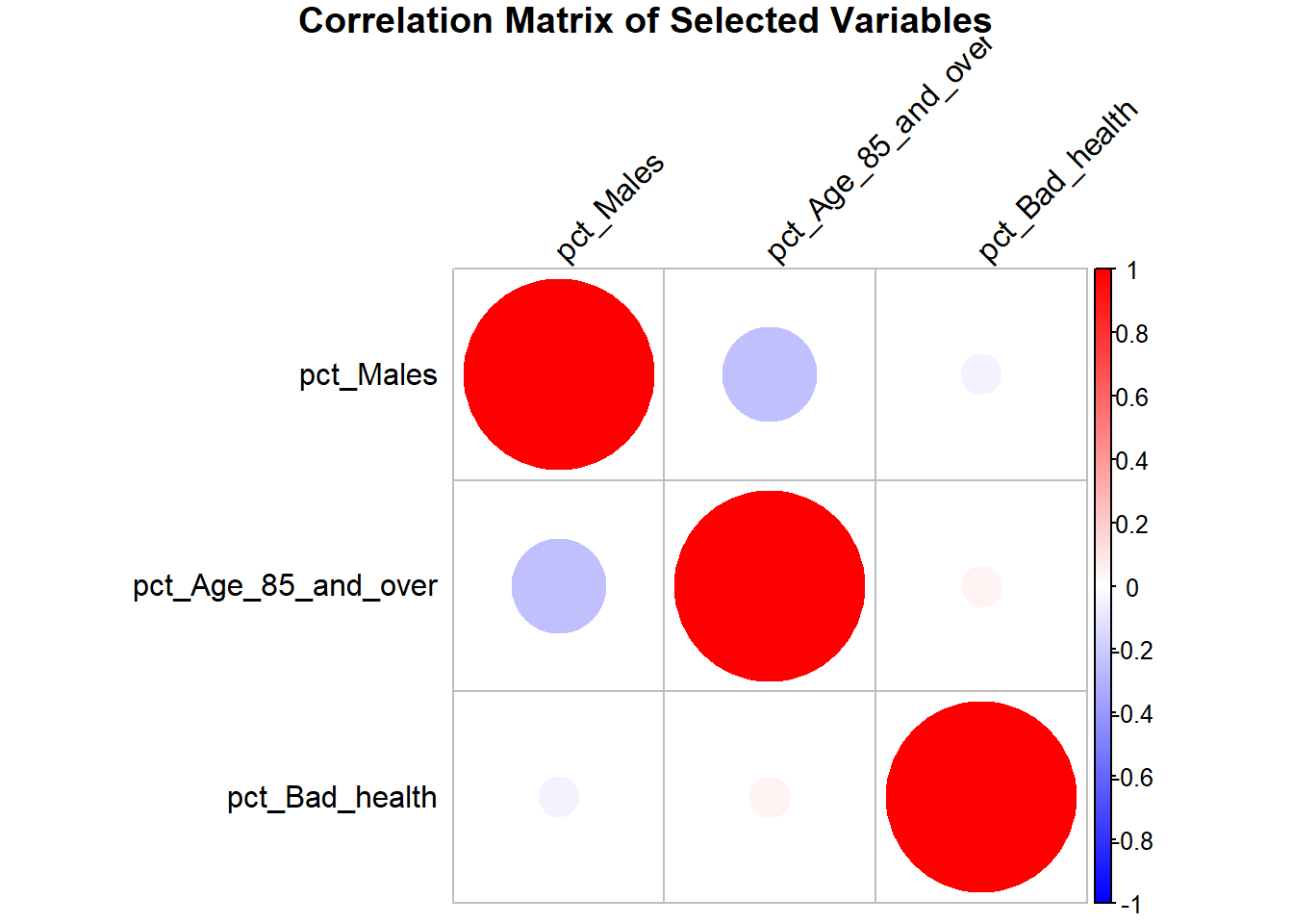
3+ Numerical Variables: Scatterplot matrix
Preparation:
library(tidyverse)

# Select the variables
selected_vars <- census_data[, c("pct_Males", "pct_Single", "pct_Bad_health")]

# Create pairwise combinations of variable names
scatter_data <- expand.grid(
 Variable1 = names(selected_vars),
 Variable2 = names(selected_vars)
)

# Add the data values for the pairs
scatter_data <- scatter_data %>%
 rowwise() %>%
 mutate(
  Value1 = list(selected_vars[[Variable1]]), # Extract values for Variable1
  Value2 = list(selected_vars[[Variable2]]) # Extract values for Variable2
 ) %>%
 unnest(c(Value1, Value2)) # Unnest the lists into rows
This code is used to create a dataset that facilitates generating pairwise scatterplots between selected variables from a dataset. First, it selects the variables of interest (pct_Males, pct_Single, and pct_Bad_health) from the census_data dataset and stores them in a new data frame called selected_vars. Then, the expand.grid() function is used to generate all possible combinations of these variables, resulting in a data frame with two columns, Variable1 and Variable2, where each row represents a pair of variables (e.g., pct_Males vs pct_Single). Finally, the mutate() function is applied to map the actual values of the paired variables (Variable1 and Variable2) to two new columns, Value1 and Value2. These columns contain the corresponding data points for the variable pair, enabling the creation of scatterplots where Value1 is plotted against Value2 for each combination.
Visualisation:
ggplot(scatter_data, aes(x = Value1, y = Value2)) +
 geom_point(alpha = 0.6, color = "blue") +
 facet_grid(Variable1 ~ Variable2, scales = "free") +
 labs(
  title = "Correlation Matrix",
  x = "",
  y = ""
 ) +
 theme_minimal()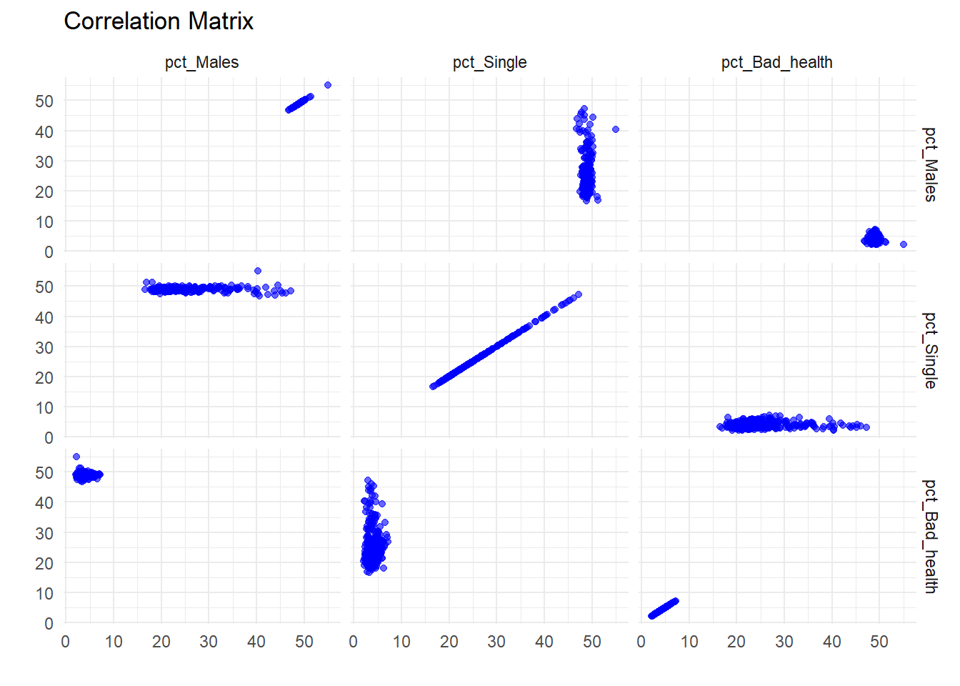
You can also include a categorical variable through colouring. Let’s try with Country.
# Ensure the original data includes the 'Country' variable
selected_vars <- census_data[, c("pct_Males", "pct_Single", "pct_Bad_health", "Country")]

# Create pairwise combinations of variable names (excluding 'Country')
scatter_data <- expand.grid(
  Variable1 = names(selected_vars)[-4], # Exclude 'Country'
  Variable2 = names(selected_vars)[-4]
)
#  %>% filter(Variable1 != Variable2) # Remove self-comparisons

# Add the data values for the pairs
scatter_data <- scatter_data %>%
  rowwise() %>%
  mutate(
    Value1 = list(selected_vars[[Variable1]]), # Extract values for Variable1
    Value2 = list(selected_vars[[Variable2]]), # Extract values for Variable2
    Country = list(selected_vars$Country)     # Include 'Country' in the data
  ) %>%
  unnest(c(Value1, Value2, Country)) # Unnest the lists into rows
Now, the scatter_data includes the Country column, which can be used to map fill in ggplot:
ggplot(scatter_data, aes(x = Value1, y = Value2, fill = Country)) +
  geom_point(alpha = 0.6, shape = 21, size = 3) + # Use shape with fill (e.g., 21)
  facet_grid(Variable1 ~ Variable2, scales = "free") +
  labs(
    title = "Scatterplot Matrix with Fill by Country",
    x = "",
    y = "",
    fill = "Country"
  ) +
  theme_minimal()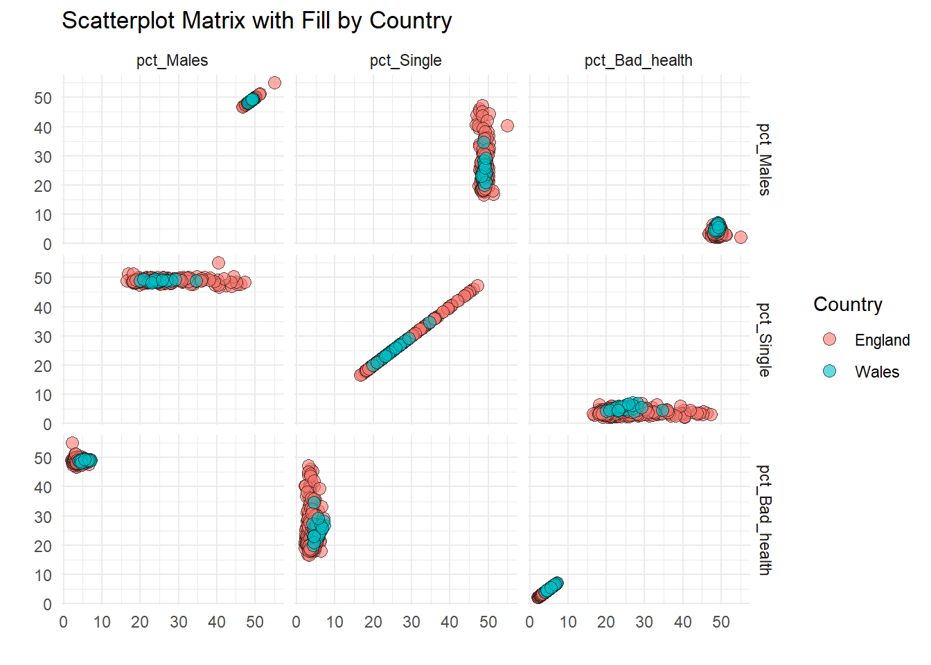
1 Numerical Variables, 2+ Cateorical Variables: Boxplot faceting
ggplot(frs_data, aes(x = marital_status, y = hh_income_gross, fill = marital_status)) +
 geom_boxplot() +
 facet_wrap(~ sex) +
 scale_y_continuous(
  limits = c(0, 100000), # limit the y-axis
  labels = label_comma() # Properly placed within scale_y_continuous()
 ) +
 labs(
  title = "Gross Household Income by Marital Status and Sex",
  x = "Marital Status",
  y = "Gross Household Income"
 ) + # Removed 'fill' label to avoid legend creation
 theme_minimal() +
 theme(
  axis.text.x = element_text(angle = 45, hjust = 1), # Rotate x-axis labels for readability
  legend.position = "none" # Corrected to lowercase 'none'
 )
Warning: Removed 2769 rows containing non-finite outside the scale range
(`stat_boxplot()`).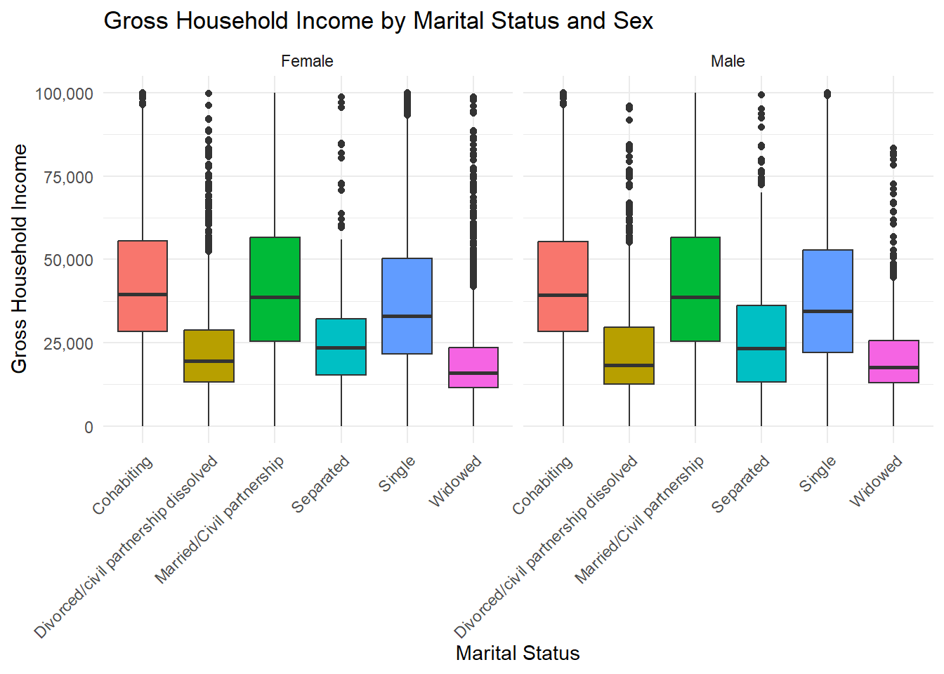
1 Numerical Variables, 2+ Cateorical Variables: Violin Plot faceting
A violin plot combines aspects of a box plot and a density plot. It displays the distribution of a continuous variable, showing its probability density across different levels of a categorical variable. The plot consists of a vertical axis representing the variable of interest and horizontal axes that group data by categorical variables. The shape of the “violin” represents the distribution’s density, often mirrored on both sides, making it easier to see the spread and skewness of the data.
ggplot(frs_data, aes(x = marital_status, y = hh_income_gross, fill = marital_status)) +
 geom_violin() +
 facet_wrap(~ sex) +
 scale_y_continuous(
  limits = c(0, 100000),
  labels = label_comma() # Properly placed within scale_y_continuous()
 ) +
 labs(
  title = "Gross Household Income by Marital Status and Sex",
  x = "Marital Status",
  y = "Gross Household Income"
 ) + # Removed 'fill' label to avoid legend creation
 theme_minimal() +
 theme(
  axis.text.x = element_text(angle = 45, hjust = 1), # Rotate x-axis labels for readability
  legend.position = "none" # Corrected to lowercase 'none'
 )
Warning: Removed 2769 rows containing non-finite outside the scale range
(`stat_ydensity()`).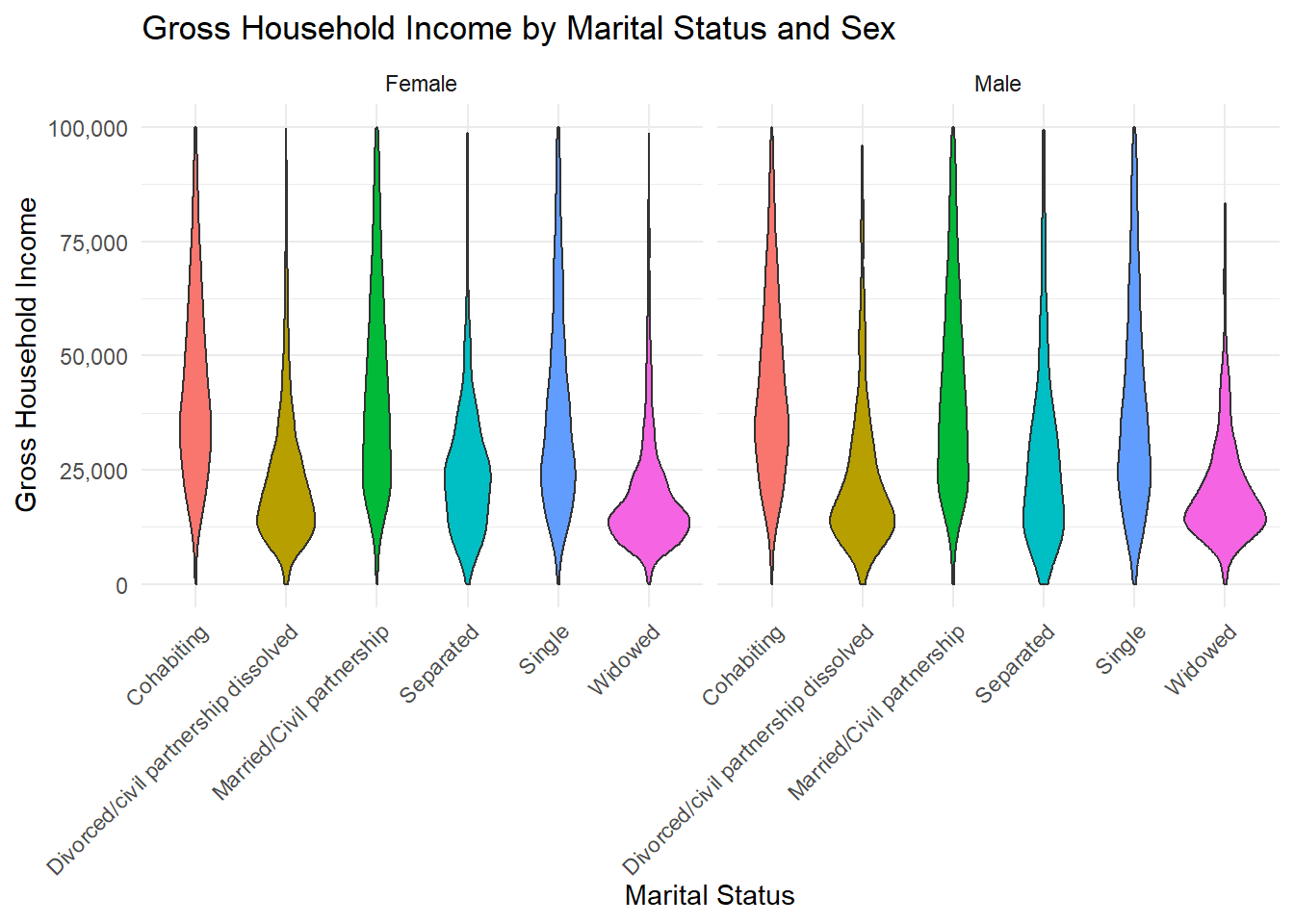
We will be using KableExtra to create nicely formatted tables for a series of ouputs in Rstudio:
library(kableExtra)Warning: package 'kableExtra' was built under R version 4.4.2
Attaching package: 'kableExtra'The following object is masked from 'package:dplyr':
group_rowsOnly for summarising statistics we use vtable that makes use of kableExtra behind the scenes. You can use the function st() or sumtable(), they do the same thing. See https://cran.r-project.org/web/packages/vtable/vignettes/sumtable.html
library(vtable)Warning: package 'vtable' was built under R version 4.4.2# Generate the summary table
st(census_data, vars = c("pct_Very_bad_health", "pct_No_qualifications", "pct_Males", "pct_Higher_manager_prof"), out = 'kable')| Variable | N | Mean | Std. Dev. | Min | Pctl. 25 | Pctl. 75 | Max |
|---|---|---|---|---|---|---|---|
| pct_Very_bad_health | 331 | 1.2 | 0.34 | 0.55 | 0.92 | 1.4 | 2.4 |
| pct_No_qualifications | 331 | 18 | 4 | 6.6 | 15 | 20 | 29 |
| pct_Males | 331 | 49 | 0.66 | 47 | 49 | 49 | 55 |
| pct_Higher_manager_prof | 331 | 13 | 4.7 | 5.5 | 9.8 | 16 | 40 |
We can also convert a basic cross tabulation to a nice table
# cross tabulation
cross_tab <- table(frs_data$health, frs_data$highest_qual)

# Convert the cross-tabulation to a data frame
cross_tab_df <- as.data.frame(cross_tab)
This will output lots of rows, but it’s just an example.
colnames(cross_tab_df) <- c("Health", "Qualification", "Percentage")

cross_tab_df %>%
 kbl(caption = "Health and Educational Qualification") %>%
 kable_styling(full_width = FALSE, position = "left") %>%
add_header_above(c(" " = 1, "Highest Educational Qualification" = 2))| Health | Qualification | Percentage |
|---|---|---|
| Bad | A-level or equivalent | 200 |
| Fair | A-level or equivalent | 868 |
| Good | A-level or equivalent | 1626 |
| Not known | A-level or equivalent | 1163 |
| Very Bad | A-level or equivalent | 55 |
| Very Good | A-level or equivalent | 1348 |
| Bad | Degree or above | 262 |
| Fair | Degree or above | 1097 |
| Good | Degree or above | 2953 |
| Not known | Degree or above | 1923 |
| Very Bad | Degree or above | 67 |
| Very Good | Degree or above | 2854 |
| Bad | Dependent child | 22 |
| Fair | Dependent child | 67 |
| Good | Dependent child | 342 |
| Not known | Dependent child | 9100 |
| Very Bad | Dependent child | 7 |
| Very Good | Dependent child | 760 |
| Bad | GCSE or equivalent | 524 |
| Fair | GCSE or equivalent | 1785 |
| Good | GCSE or equivalent | 3061 |
| Not known | GCSE or equivalent | 2165 |
| Very Bad | GCSE or equivalent | 133 |
| Very Good | GCSE or equivalent | 2061 |
| Bad | Not known | 841 |
| Fair | Not known | 1804 |
| Good | Not known | 1674 |
| Not known | Not known | 1447 |
| Very Bad | Not known | 279 |
| Very Good | Not known | 775 |
| Bad | Other | 231 |
| Fair | Other | 696 |
| Good | Other | 854 |
| Not known | Other | 587 |
| Very Bad | Other | 64 |
| Very Good | Other | 450 |
colnames(cross_tab_df) <- c("Health", "Qualification", "Percentage"). This assigns new column names to the data frame cross_tab_df.kable: cross_tab_df %>% kbl(caption = "Health and Educational Qualification"). This uses the kbl function from the kableExtra package to create a basic, well-formatted table. The caption argument adds a title to the table: “Health and Educational Qualification.%>% kable_styling(full_width = FALSE, position = "left"). This enhances the appearance of the table with the kable_styling function. full_width = FALSE ensures the table is not stretched to the full width of the document or webpage; position = "left": Aligns the table to the left side of the page.%>% add_header_above(c(" " = 1, "Highest Educational Qualification" = 2)) Adds an additional header row above the table; " " = 1 the first column (“Health”) has a blank header in this new row; "Highest Educational Qualification" = 2: The next two columns (“Qualification” and “Percentage”) are grouped under the label “Highest Educational Qualification.Finally, we can derive a table to show the Multiple Linear Regression results.
# Load required libraries
library(broom)

# Fit the regression model
model <- lm(pct_Very_bad_health ~ pct_No_qualifications + pct_Males + pct_Higher_manager_prof,
      data = census_data)
Let’s tidy up the regression output.
regression_table <- tidy(model) %>%
 select(term, estimate, std.error, statistic, p.value) %>%
 rename(
  Term = term,
  Estimate = estimate,
  `Std. Error` = std.error,
  `t value` = statistic,
  `P value` = p.value
 )
Create and style the regression table
regression_table %>%
 kbl(
  caption = "Regression Results: Predicting Very Bad Health Percentage",
  digits = 3,
  col.names = c("Term", "Estimate", "Std. Error", "t Value", "P Value")
 ) %>%
 kable_styling(full_width = FALSE, bootstrap_options = c("striped", "hover", "condensed")) %>%
 column_spec(2:5, width = "3cm") %>% # Adjust column widths
add_header_above(c(" " = 1, "Coefficients" = 4)) # Add grouped header| Term | Estimate | Std. Error | t Value | P Value |
|---|---|---|---|---|
| (Intercept) | 4.003 | 0.880 | 4.550 | 0.000 |
| pct_No_qualifications | 0.053 | 0.006 | 8.937 | 0.000 |
| pct_Males | -0.074 | 0.018 | -4.121 | 0.000 |
| pct_Higher_manager_prof | -0.013 | 0.005 | -2.670 | 0.008 |
kable_styling() This function customizes the appearance of a kable table. The arguments used are:
full_width = FALSE: Ensures the table is not stretched to fill the entire width of the page.
bootstrap_options = c("striped", "hover", "condensed"):
striped: Adds alternating row colors for better readability.
hover: Highlights rows when hovered over with the mouse (for HTML tables).
condensed: Reduces the table’s vertical spacing, making it more compact.
column_spec(2:5, width = "3cm"). This function customizes specific columns of the table.
2:5: Targets columns 2 through 5 for styling.
width = "3cm": Sets the width of these columns to 3 cm, ensuring uniform and readable column sizes.
add_header_above(c(" " = 1, "Coefficients" = 4)). This function adds an additional header row above the table. This is used to customize the header of a table.
" " = 1 Leaves the first column (e.g., the Term column) without a header, spanning 1 column."Coefficients" = 4: This part means that columns 2, 3, 4, and 5 will be grouped together under one header, which is labeled as “Coefficients” (4 here indicates the other 4 tables). Essentially, these columns will have the same header, which makes the table more readable and organized.Have a look here for some details on kableExtra https://bookdown.org/yihui/rmarkdown-cookbook/kableextra.html.